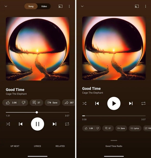
Google has once again decided to give YouTube Music a facelift, this time focusing specifically on the Now Playing screen for both Android and iOS. 
While some users may roll their eyes at yet another update, others will appreciate the small but meaningful tweaks aimed at making the experience smoother and more intuitive. Unlike the splashy Material 3 Expressive redesign from earlier this year – where color palettes and shapes took center stage – this overhaul is less about paint and more about practicality.
So, what’s actually changed? At the very top, the long-familiar Song/Video switcher is gone, replaced with a simpler interface that reduces clutter. The Cast icon still sits comfortably in the upper right, alongside the three-dot overflow menu, so casting to your speakers or TV remains just a tap away. Below that, the playback controls – Shuffle, Skip Back, Play, Skip Forward, and Repeat – have been shifted above the progress bar. This bar itself is noticeably thicker, a subtle design choice that makes scrubbing through a track easier, especially on smaller screens.
Another significant change is how user interaction buttons have been rearranged. Previously, you had the familiar thumbs up/down, comment, save, and share options. Now, Google has swapped them out for a carousel that includes thumbs up/down, lyrics, and a new Song/Video toggle. Placing them under the progress bar gives the interface a sense of order while freeing up the main playback area for music controls.
One of the most useful tweaks comes with the new ‘handle’ that replaces the old Up Next button. Drag it upwards, and you’ll see which playlist or radio channel is running. Tap it, and you get a split view: the Now Playing screen on top and a preview of the next four songs queued up. This layout cleverly combines information without overwhelming the screen, giving listeners more context without breaking the flow.
The Related menu and Lyrics feature are also easier to access. Tap and expand them to get more info, and when minimized, the app neatly shows the title of the track you’re enjoying. It’s small touches like this that make the redesign feel less like change for change’s sake and more like a thoughtful refinement of the listening experience.
Of course, there’s a catch: the update is rolling out server-side, meaning you might not see it immediately. On Android, some users have managed to trigger the new UI by force-stopping the app. The trick is to head into Settings > Apps > All apps, locate YouTube Music, hit Force Stop, and then reopen. That said, this workaround is far from guaranteed, so don’t be surprised if nothing happens.
Why does Google keep tinkering with its apps? On one hand, it can feel like there’s a team of designers locked in a room, mandated to shuffle buttons every few months. On the other hand, these updates keep apps fresh and responsive to user habits, preventing stagnation in a market where competition is fierce.
Speaking of competition, YouTube Music isn’t operating in a vacuum. Spotify continues to dominate with its stellar playlists and personalized recommendations, though its long-promised lossless tier is only now trickling out. Apple Music, meanwhile, holds bragging rights when it comes to audio quality, thanks to lossless and Spatial Audio support. Yet, YouTube Music has its own ace: a vast and unique catalog that includes remixes, live performances, and tracks you simply won’t find elsewhere. For users who prioritize sheer breadth of content, it’s hard to beat.
In practice, this means the choice comes down to priorities. If audio fidelity is your holy grail, Apple Music stands tall. If you crave smart recommendations and free ad-supported listening, Spotify remains a safe bet. But if you value library size and the quirky uploads only YouTube can deliver, YouTube Music is quietly carving out a niche that’s bigger than it looks at first glance.
Ultimately, the new Now Playing UI may not revolutionize the app, but it does refine it. It’s cleaner, a bit more user-friendly, and a reminder that in the fast-moving world of music streaming, even subtle changes can make a difference in how we experience our daily soundtrack.
1 comment
ok update but they shud add gapless playback already ffs