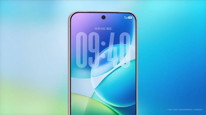
vivo has revealed the sleek and glossy design of its upcoming OriginOS 6, and it’s clear that the company wants to make a statement this year. The new interface moves closer to a ‘liquid glass’ aesthetic, filled with soft transparency, blurred depth effects, and seamless animations. While many have compared it to Apple’s recent iOS 26 visual style, vivo seems to be leaning into its own theme – calling it ‘water’ instead of glass – to better align with its organic branding. 
Regardless of the name, the result is undeniably modern and fluid.
The interface has been refined with smoother transitions and improved animations around the camera punch-hole area, giving users a more polished visual experience. There’s also a stronger emphasis on AI, with vivo introducing smarter assistant interactions, predictive tools, and enhanced personalization. One of the most eye-catching elements is the glowing pop-up animation for the digital assistant, accompanied by a lock screen clock that subtly shimmers like rippling water.
Still, not everyone seems impressed. Some fans see it as another example of Chinese brands chasing Apple’s design philosophy, while others believe it’s a clever adaptation that reflects vivo’s distinct design language. The company, however, appears confident that its AI improvements and visual polish will help OriginOS 6 stand apart. The update will roll out globally starting October 15, and vivo has already opened a Preview Program for users eager to test the Android 16-based system on both vivo and iQOO devices. Whether it’s originality or imitation, OriginOS 6 is about to make waves – quite literally.
4 comments
Finally no more LametouchOS, took them long enough 😂
Every phone UI now looks like iOS, it’s getting ridiculous 🙄
Yeah all of them copying old LG Crystal UI, history repeats 🤣
They should just call it Vivo iOS lmao, why buy the copy if I can get the original 😭