Top 3 One UI 8.5 Features You Shouldn’t Miss
Samsung’s software journey has always been about finding the balance between powerful functionality and an interface that feels natural to use every day. After One UI 7.0 introduced a significant design overhaul, the immediate successor One UI 8.0 kept things more subtle, focusing on under-the-hood improvements and smaller tweaks. But with One UI 8.5, Samsung is once again aiming to surprise its users by delivering meaningful changes that reshape how you interact with your Galaxy smartphone. These refinements are not just cosmetic; they reflect Samsung’s growing attention to user feedback and a push toward deeper customization. 
Below, we explore the three most exciting features coming with One UI 8.5 in detail.
1. A Fully Customizable Quick Panel
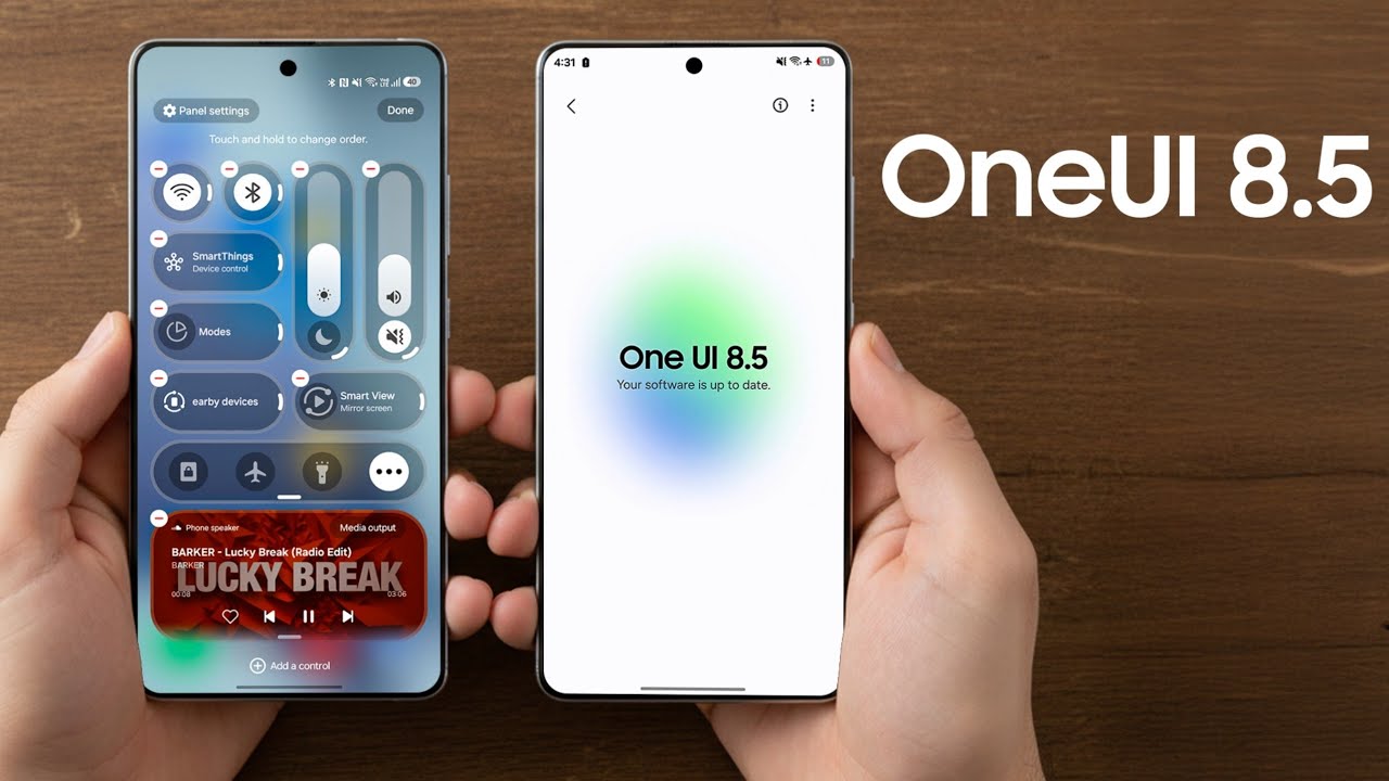
The Quick Panel is arguably one of the most-used components of any Android phone, and Samsung is taking its flexibility to the next level. With One UI 8.5, the Quick Panel is now entirely customizable, offering users unprecedented control. You can choose to remove all toggles entirely if you want a minimalist look, or add as many as you find useful. Each toggle can be resized, rearranged, or even repositioned to match your daily habits. The sliders for brightness and volume, traditionally placed at the top or bottom in fixed orientations, can now be laid out vertically or horizontally depending on personal preference. This level of control is particularly helpful for users who prefer one-handed use or want a clean, distraction-free interface.
One of the more noticeable decisions Samsung made here is to allow the removal of less frequently used toggles such as Home, Mode, Nearby Devices, and Smart View. These options, while powerful, were often ignored by most users. By letting you strip away what you don’t need, Samsung has embraced minimalism without taking away power. The result is a Quick Panel that adapts to you, not the other way around. Early demos show how much smoother and more efficient this makes daily navigation, and many power users will appreciate the fresh freedom it brings.
2. Stock Apps with a Cleaner Look
Another area where One UI 8.5 shines is in the visual redesign of Samsung’s stock apps. Apps like Gallery, Phone, and My Files now feature a reworked tab bar. The labels beneath the icons have been removed, allowing the tab bar to shrink in height and give more space to the actual content. This may sound like a small change, but the extra real estate makes a noticeable difference, especially on smaller screens or when browsing large collections of photos and files.
Beyond the tab bar, other UI elements across the apps have been optimized. In the My Files app, for example, shortcuts to quickly access certain file types now take up less vertical space, reducing unnecessary scrolling. By compressing these interface elements, Samsung creates a cleaner, more focused environment where the user’s content, not the interface itself, is the star. It’s an approach reminiscent of what we see in minimalist app design trends across the industry, but Samsung ensures functionality is never sacrificed for style.
These app redesigns also help unify the visual language of One UI, making it feel more cohesive and polished. For long-time Galaxy users, this update provides a more modern experience without requiring a learning curve. Everything is still familiar, but it feels sleeker and more refined.
3. Search Bar Accessibility Reimagined
Samsung seems to be revisiting some of the core principles it introduced when One UI was first launched years ago. In One UI 1.0, the philosophy of “making large screens usable with one hand” was central, and One UI 8.5 brings back a practical extension of this idea by relocating the search bar in its stock apps. Instead of forcing users to reach up to the top of the screen, the search bar is now placed at the bottom. This change is visible in apps like My Files and Settings in early builds, and it is highly likely that more stock apps will adopt the same placement.
The benefit of this is clear: you no longer need to stretch your thumb awkwardly or use two hands just to search within an app. The bottom search bar feels natural for modern smartphone use, where ergonomics and speed are critical. This seemingly small tweak could have a significant impact on everyday usability, especially for users of Samsung’s larger devices like the Galaxy S Ultra or Galaxy Z Fold series.
Other Subtle but Notable Improvements
While these three features headline the update, Samsung hasn’t stopped there. One UI 8.5 also introduces NFC-based Quick Share for faster and more seamless file sharing, further enhancing its ecosystem’s connected experience. The Gallery app is set to retire its OneDrive backup option, marking a shift in how Samsung integrates cloud services. Meanwhile, the software update screen has been redesigned with more prominent One UI branding, signaling the company’s intent to highlight its platform identity more strongly. Even the battery icon has been subtly refined to appear more compact and aligned with the streamlined aesthetic of the rest of the UI.
Taken together, these updates show Samsung’s determination to refine every layer of the experience, from the tools you interact with daily to the smaller details that polish the overall presentation. One UI 8.5 may not feel as radical as the shift from One UI 6 to One UI 7, but it represents a confident step forward, balancing new customization powers with thoughtful design updates. For Galaxy users, the message is clear: your phone is about to become even more personal, more ergonomic, and more efficient.
1 comment
removing onedrive backup from gallery is kinda annoying