Samsung’s software design journey continues to evolve, and the upcoming One UI 8.5 release looks set to deliver one of the most noticeable visual updates to the Galaxy ecosystem in years. While One UI 7.0 marked a bold step by introducing gradient colors to refresh stock app icons, and One UI 8.0 stayed visually conservative without further modifications, the new mid-cycle update is preparing to push Samsung’s design language into more expressive territory.
A new 3D visual layer for app icons
Recent leaked builds of One UI 8.5 have revealed Samsung’s experimentation with three-dimensional styling. App icons now feature subtle shadows, curved depth effects, and layers that make them appear to pop off the screen. This is a clear departure from the flatter designs seen in previous versions. Instead of the minimalist two-dimensional approach, Samsung seems eager to inject more personality into its UI elements while still retaining the gradient foundation introduced earlier.
The change is not yet universally applied across all apps in the leaked firmware. Some stock apps already showcase the richer 3D styling, while others remain unchanged. 
Interestingly, even several third-party icons are beginning to adopt the updated look, suggesting that Samsung could be preparing a more system-wide consistency update. However, since this is an early development build, there is no guarantee that the design will ship exactly as seen in these tests. Samsung has a history of experimenting with visual tweaks before deciding on a final approach.
Comparisons with One UI 8.0
When comparing One UI 8.0 to One UI 8.5, the difference is immediately noticeable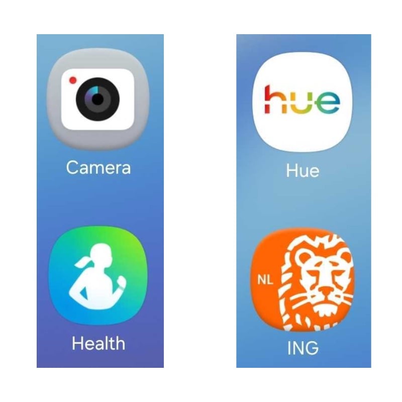
. Icons that once looked flat and static now feature shading that makes them look more tactile and modern. This design approach reflects a wider industry trend: after years of flattening everything down, major tech companies are carefully reintroducing depth, lighting, and subtle realism back into their interfaces. Samsung’s 8.5 update aligns with this shift while maintaining the signature Galaxy identity.
According to early testers, these enhancements create a sense of liveliness across the UI, making navigation feel more dynamic. While gradients keep the icons colorful and fresh, the new layering effect makes them look more premium, which may better complement Samsung’s upcoming high-end hardware releases.
Beyond icons: a refined UI structure
The design refresh doesn’t stop at icons. Samsung is reportedly overhauling its stock app layouts too. A new pill-shaped tab bar has been spotted at the bottom of the screen, making the interface feel more compact and minimal. Unlike previous iterations where labels accompanied tab icons, the text is being removed in One UI 8.5 to create a sleeker, more uniform appearance. This change reduces clutter and pushes One UI closer to the clean design philosophies seen in iOS and other modern Android skins.
All of these design updates are expected to arrive with the launch of the Galaxy S26 series early next year, where One UI 8.5 will make its official debut. Samsung fans can expect a more visually engaging experience that blends Samsung’s established gradient design language with a fresh touch of dimensionality and elegance.
While it remains to be seen whether Samsung will commit to this exact 3D look in the final release, what is clear is the company’s continued willingness to experiment and refine its user experience. For those who care about smartphone aesthetics as much as performance, One UI 8.5 may be one of the most interesting updates in years.
2 comments
pls samsung stop changing icons every year
tbh i prefer flat design, 3d feels 2010