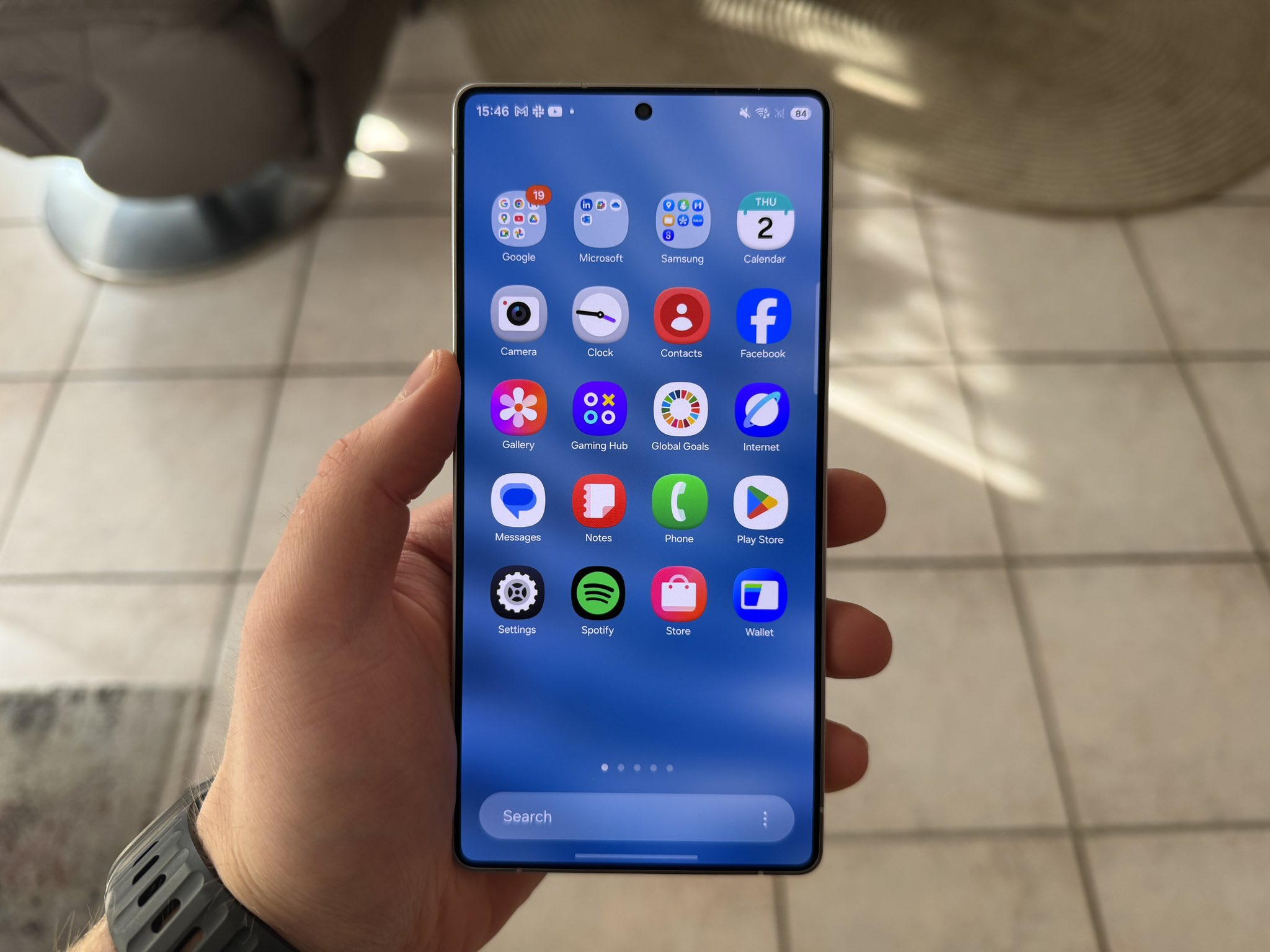
Samsung is gearing up to refresh its mobile interface with the upcoming One UI 8.5, and early leaks already show a direction that feels heavily inspired by Apple’s recently unveiled iOS 26. 
What’s most striking is not just a borrowed sense of depth and gloss but also how Samsung appears to be revisiting its own design legacy, adding a nostalgic twist to its next-generation interface.
3D app icons make a comeback
For years, Samsung’s One UI stuck to flat, colorful icons in line with minimalist design trends across Android. Now, a new visual identity is emerging. According to well-known leaker Ice Universe, screenshots from internal builds of One UI 8.5 reveal a major shift: 3D-style app icons with shadows and a layered look. Core Samsung apps like Messages, Gallery, and Settings have all been reimagined with depth, while third-party apps such as YouTube and Google Play also display consistent 3D rendering. This makes the icons look as though they are floating above the background, giving the home screen a tactile, almost retro feel reminiscent of the skeuomorphic design era.
A design philosophy caught between Apple and nostalgia
The timing of this change is telling. Apple’s iOS 26 has leaned heavily into its so-called Liquid Glass aesthetic, where transparency, depth, and soft gradients create a more immersive interface. Samsung’s new look echoes this, but it also harks back to its TouchWiz days. Older Galaxy devices, especially around the Galaxy S6 era, featured icons with drop shadows that offered a similar sense of weight. For some longtime users, One UI 8.5 feels less like imitation and more like a callback – blending Samsung’s own history with Apple’s current design direction.
Battery impact and early performance worries
Of course, design changes aren’t only about looks. Early testers of leaked One UI 8.5 builds have noted that rendering 3D icons and layered shadows places extra strain on hardware. Reports suggest noticeable impacts on battery efficiency, with devices draining faster during heavy use. This isn’t unusual for development builds, and optimizations may fix these issues by launch, but it raises questions about whether Samsung’s design gamble will come at the cost of longevity. Apple has faced similar criticisms over its more resource-intensive animations, and Samsung now seems to be dealing with the same balancing act.
Is this the beginning of another 3D era?
The smartphone industry tends to cycle between extremes. A decade ago, skeuomorphism dominated before being discarded for flat minimalism. Now, both Apple and Samsung appear to be reviving depth, gloss, and shadow as defining characteristics of their software. But is this progress or a step backward? Some users welcome the change, saying it gives their phones a fresh, premium look. Others argue it’s superficial, consuming battery life without delivering functional improvements. Google’s contrasting approach with Android 16’s Material 3 Expressive design leans more toward bold color systems and playful shapes than glossy realism, suggesting the Android ecosystem is heading in multiple aesthetic directions at once.
The bigger picture
Ultimately, One UI 8.5’s 3D icons highlight a broader truth: smartphone design is no longer about strict innovation but about borrowing, remixing, and refining. Samsung isn’t just taking cues from Apple; it’s also drawing from its own history. Whether users will embrace this “new old look” depends on how seamlessly Samsung balances style, performance, and battery life. If done right, the Galaxy S26 generation could signal a rebirth of expressive, visually rich interfaces. If not, it may simply confirm that not every nostalgic comeback deserves a second life.
2 comments
3D icons again? feels like 2014 all over again, not sure if thats good or bad 😂
I actually like it, feels more alive than the flat boring icons we had for years