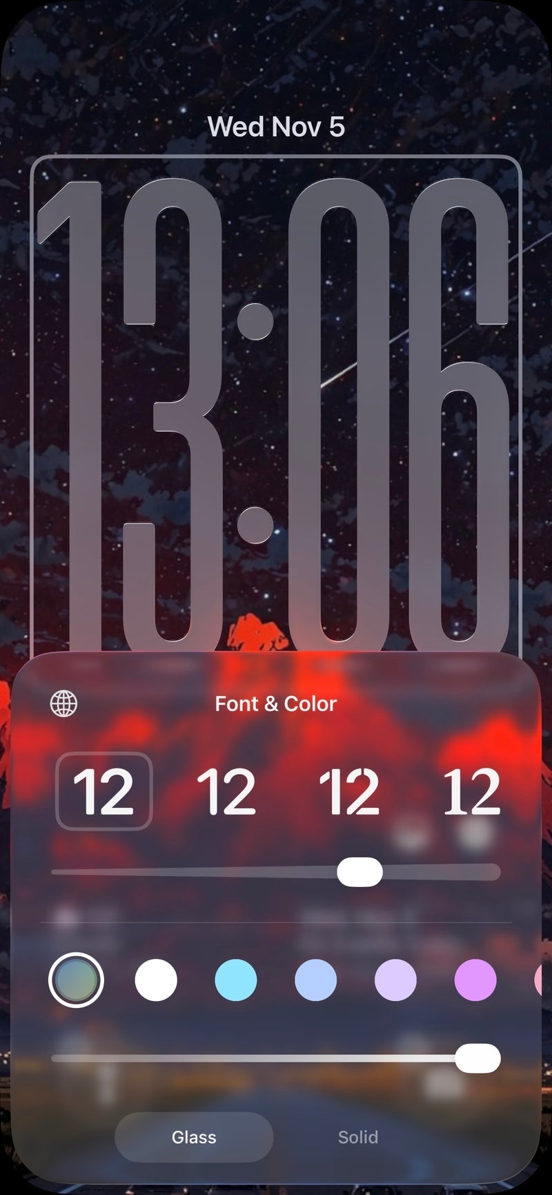
iOS 26.2 beta quietly adds a precision transparency slider for the Lock Screen
Apple’s newest iOS 26.2 beta doesn’t shout; it fine-tunes. Tucked inside the Lock Screen editor is a new transparency slider that gives you granular control over how prominently the time appears against your wallpaper. It’s a simple control with outsized impact, especially in Apple’s glossy Liquid Glass aesthetic that arrived with iOS 26 and continued to evolve in iOS 26.1.
To understand why this slider matters, it helps to know what Liquid Glass is aiming for. Apple’s current design treats the Lock Screen like a sheet of polished glass: light, depth, blur and tint respond to your background image to keep things legible while preserving the art beneath. In iOS 26.1, you could choose between a clearer or more tinted look. Useful, yes, but binary. iOS 26.2 replaces that either/or with a continuous scale, letting you set the exact sweet spot between subtle and solid.
Where to find it: press and hold on your Lock Screen, tap Customize → Wallpaper, then tap the clock. You’ll see a slider that adjusts transparency in real time. Slide left for a barely-there clock that lets photography shine, or right for a bold, fully opaque readout that cuts through noisy backgrounds. The control works across Apple’s font options for the clock, and changes apply to the specific Lock Screen you’re editing, so different setups can have different levels.
Compared with the Clear vs. Tinted toggle from 26.1, the difference is night and day. The new control isn’t a preset – it’s continuous. That means you can make microscopic adjustments until the clock harmonizes with your wallpaper’s contrast and color. If you favor minimalist vibes, you can take transparency low and let your image carry the look. If you rely on your Lock Screen for quick glances in bright sunlight, you can crank opacity for relentless legibility.
There is one caveat: Apple still restricts clock resizing to the default font. If you switch to another Lock Screen typeface, the size control remains off-limits. Here’s hoping later betas broaden that flexibility so typography, size, and transparency can all be tuned together.
Why you might care: readability, style, and accessibility. On OLED iPhones with always-on displays, a slightly more opaque clock can prevent halos and improve at-a-glance clarity without resorting to heavy tints that flatten your photo. Conversely, for cinematic wallpapers, dialing down opacity keeps the art front and center while the time becomes a tasteful overlay. Users with mild vision strain may prefer a higher-contrast, higher-opacity setting – paired with bold weight – for comfortable daily use.
Pro tips for better results: choose wallpapers with intentional negative space (a clear sky, blurred bokeh, soft gradients) and then set the slider so numerals sit on that calmer region. If you maintain multiple Lock Screens tied to Focus modes – work, gym, travel – give each its own transparency personality: high contrast for work, mid for travel (so widgets and city photos balance), and low for a moody evening setup. The slider stacks with color accents and font choices, so experiment until your lock glance looks cohesive rather than cobbled together.
From an editorial perspective, this is a classic Apple move: polish over pageantry. The feature won’t headline a keynote, but it meaningfully expands the Lock Screen’s expressive range without adding clutter. Combined with ongoing tweaks to Liquid Glass – and other 26.2 changes landing across Health and Podcasts – this slider shows Apple is still iterating on the fundamentals of how your phone greets you hundreds of times a day.
Bottom line: small control, big payoff. Whether you want your clock to whisper over a moody photo or shout through a busy travel snapshot, iOS 26.2 finally hands you the dial.
1 comment
idk why this wasn’t in 26.0, feels obvious tbh