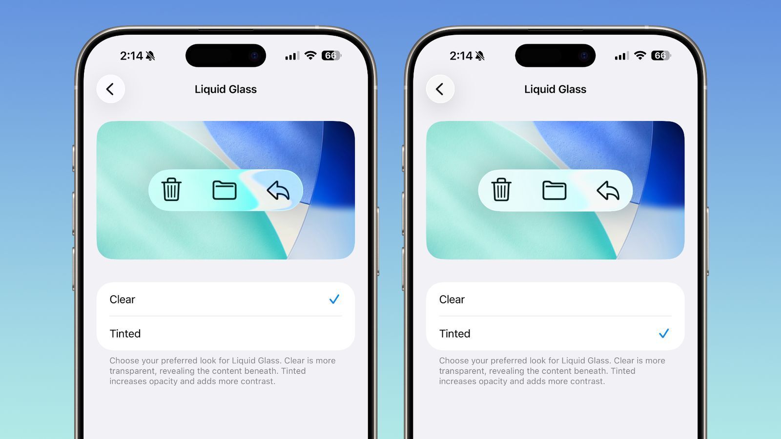
Apple is preparing another visual evolution for its ecosystem, as iOS 26.1, iPadOS 26.1, and macOS 26.1 approach their official release. The latest fourth beta reveals that the company is responding directly to user feedback by expanding customization options for its striking new Liquid Glass design. This design, which first appeared earlier this year, reimagines how transparency and depth interact across the interface. 
Now, users will gain the ability to adjust exactly how translucent or opaque their interface looks – offering a balance between visual flair and everyday usability.
The new toggle in iOS 26.1 allows you to choose between two styles: Clear and Tinted. The Clear mode, which users are already familiar with, maintains the glassy, transparent look that reveals subtle hints of the background behind buttons, navigation bars, and menus. This creates a fluid and dynamic experience, especially on OLED displays where layered visuals pop beautifully. The new Tinted mode, however, caters to those who prefer stronger contrast or find the transparency difficult on the eyes. It slightly increases opacity and adjusts contrast ratios, making elements like text and icons stand out more distinctly against their backgrounds.
Apple has positioned this setting in an intuitive location: for iPhone and iPad users, it appears under Settings → Display & Brightness, while Mac users will find it under System Settings → Appearance. Once adjusted, the system-wide change immediately affects menus, system apps, and even Lock Screen notifications. This ensures a consistent aesthetic and accessibility benefit, whether you’re browsing in Safari, navigating Maps, or viewing alerts on your lock screen.
The company reportedly added this feature after beta testers voiced concerns that the new Liquid Glass visuals, while elegant, sometimes made interface elements hard to distinguish. Apple’s response underscores a shift toward greater personalization – a trend that’s becoming a defining characteristic of its modern software. Rather than enforcing a single vision of design minimalism, Cupertino is now giving users more tools to tune the system to their needs. It’s a subtle but meaningful acknowledgment that beauty and usability must coexist.
Beyond Liquid Glass customization, iOS 26.1 introduces several smaller but impactful improvements. Among them is a redesigned slide-to-stop feature for alarms and timers. Instead of simply tapping to stop an alarm, users will need to perform a slide gesture – a move that minimizes accidental dismissals and adds a tactile sense of intent. Snoozing, however, remains as simple as a tap. The update also brings additional language support for Apple Intelligence, a redesigned Apple TV app icon, and subtle refinements within the Settings app that align it with the visual refresh introduced earlier this year.
Insiders suggest that iOS 26.1 will roll out publicly toward the end of October or early November. As with previous minor-point releases, it’s less about dramatic overhauls and more about refinement – Apple’s trademark polish applied to the small details that shape the daily user experience. Combined with macOS Tahoe 26.1 and iPadOS 26.1, this release cycle further unifies Apple’s ecosystem design language, pushing the seamless integration between devices even further.
From a broader perspective, Liquid Glass represents Apple’s evolving philosophy of digital material design. It builds on the legacy of skeuomorphism and flat design by blending them – creating digital layers that feel tangible yet ethereal. The ability to fine-tune transparency makes it more inclusive for users who prioritize clarity without sacrificing the aesthetic Apple is known for. It’s a small update, but one that perfectly reflects Apple’s design DNA: minimalist, functional, and unapologetically beautiful.
1 comment
im still on ios 18… this makes me feel ancient 😂