Google’s Gradient Era: Why Maps, Photos, and More Are Getting a New Look
Google is rolling out a cohesive visual refresh across its ecosystem, and the headline change is subtle but pervasive: flowing four-color gradients now stand where flat blocks of red, yellow, green, and blue once lived. Earlier this year the Google app’s icon moved first, replacing the hard segmented G with a continuous gradient that blends red into yellow, yellow into green, and green into blue. Two months later Gemini followed, trading its blue-purple sparkle for a four-color, gradient-infused mark that aligns with Google’s core palette.
In September, Google framed the shift as a way to express momentum in artificial intelligence across the company. In practical terms, that means a single visual language intended to be instantly recognizable, scalable across platforms, and flexible enough to sit comfortably in light or dark mode, on Android or iOS, and in product marketing or on a tiny launcher grid. The gradient approach is being positioned as the face of “all of Google,” and the company says the rollout will continue across products, platforms, and services over the coming months.
What’s new in Maps and Photos
The latest wave reaches two of Google’s most familiar icons: Maps and Photos. The Google Maps pin keeps its unmistakable silhouette, but the details have been tuned. The pin is slimmer with a larger eyelet, and the color treatment now flows as a gradient instead of hard-edged color wedges. The previous dual blues that once split the head of the pin are gone, replaced by a single continuous blend that reads cleaner at small sizes and more contemporary on high-density screens.
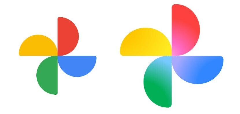
Google Photos keeps its four-blade pinwheel, staying true to decades of brand recognition. The shift happens inside each blade: colors now transition from center to edge, creating depth without resorting to heavy shadows. The overall mark is also slightly larger, a practical tweak that helps legibility on crowded home screens. Side by side, both icons feel like part of the same family as the refreshed Google and Gemini marks – less boxy, more fluid, and friendlier to today’s UI environments.
Why gradients, and why now?
Gradients are not just a fashion cycle; they solve real constraints in modern iconography. On dense, variable backgrounds, hard partitions can alias or vibrate; a controlled blend reads as one shape first and colors second. The move also mirrors Google’s broader AI narrative: fluid motion, seamless handoffs between features, and a sense of continuous learning. While the company speaks in brand language about brighter hues and creative energy, the practical benefit is consistency. With a single gradient logic applied to everything from search to creative tools, Google can update individual apps without fracturing the system’s visual identity.
When will you see the changes?
As with most Google updates, the rollout is staged. Some devices already show the new Google and Gemini icons; others still display older Maps and Photos designs for now. That stagger is normal: icon resources ship with app updates, propagate through regional stores, and only then appear on devices after caches clear. If your Pixel or Android phone still shows the previous visuals, expect the refresh to land as your apps update over the coming weeks.
Which apps are likely next
Several high-profile candidates seem primed for the gradient treatment. Play Store, Chrome, and Calendar currently rely on more segmented interpretations of the four colors. Given Google’s stated plan to continue the refresh, it’s logical to expect these staples to adopt gradient logic that better aligns with the new family. The goal is not to erase familiarity, but to sand down the hard edges so the whole suite feels authored by one hand.
Design and usability implications
For users, the payoffs are small but constant: cleaner shapes that scale better, fewer jagged seams on high-contrast wallpapers, and quicker recognition when glancing at a busy dock. For accessibility, higher perceived unity inside each icon can reduce visual noise without sacrificing the color cues people rely on to differentiate Google apps at a glance. For designers and developers, the refresh hints at a simpler rulebook – one palette, one blending logic, many contexts – making it easier to extend the system to future products without inventing new visual metaphors each time.
Bottom line
Google’s gradient era is less about chasing a trend and more about consolidating an enormous ecosystem behind a single, flexible idea. Maps and Photos look fresher; the Google and Gemini marks now feel like bookends for a family in motion. If the company follows through across Play Store, Chrome, Calendar, and beyond, the result will be a tidier, more coherent grid on your phone – and a visual language that matches Google’s story about AI: constantly blending, adapting, and moving forward.
1 comment
Photos icon finally looks bigger. my thumbs are grateful 😂