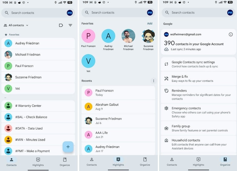
Google has quietly refreshed its Contacts app with a sleek Material 3 Expressive redesign, bringing subtle but welcome improvements. 
The update, rolling out via the Play Store, streamlines the interface and makes navigating your address book easier.
The new look trims down the bottom navigation bar, while keeping the same three tabs: Contacts, Highlights, and Organize. Tapping on any of these reveals a major change – each name now appears inside rounded containers, making the list more readable and reducing misclicks compared to the previous design where names blended together.
Individual contact pages also get a makeover. Each contact is presented on a larger card featuring a bold avatar and their name, with four key actions – Call, Message, Video, and Email – now placed inside pill-shaped buttons instead of simple circles. This not only looks more modern but also makes the actions stand out more clearly.
The update is included in version 4.6.1.x of the app. To check your version, head to Settings > Apps > See all apps > Contacts, and scroll down to view the installed version. The redesign has already appeared on devices like the Pixel 6 Pro running the Android 16 QPR1 beta.
While Google Contacts isn’t the most heavily used app on your phone, this thoughtful refresh makes it more polished, functional, and visually consistent with other Material 3 updates. It may not be a dramatic overhaul, but it’s another sign of Google’s steady push to unify its Android experience.
5 comments
lol they put lipstick on a pig 🐷
Finally, easier to tap contacts, no more misclicks lol
still waiting for them to fix sync bugs tho..
looks same to me tbh 🤷
the pill buttons actually look kinda nice ngl