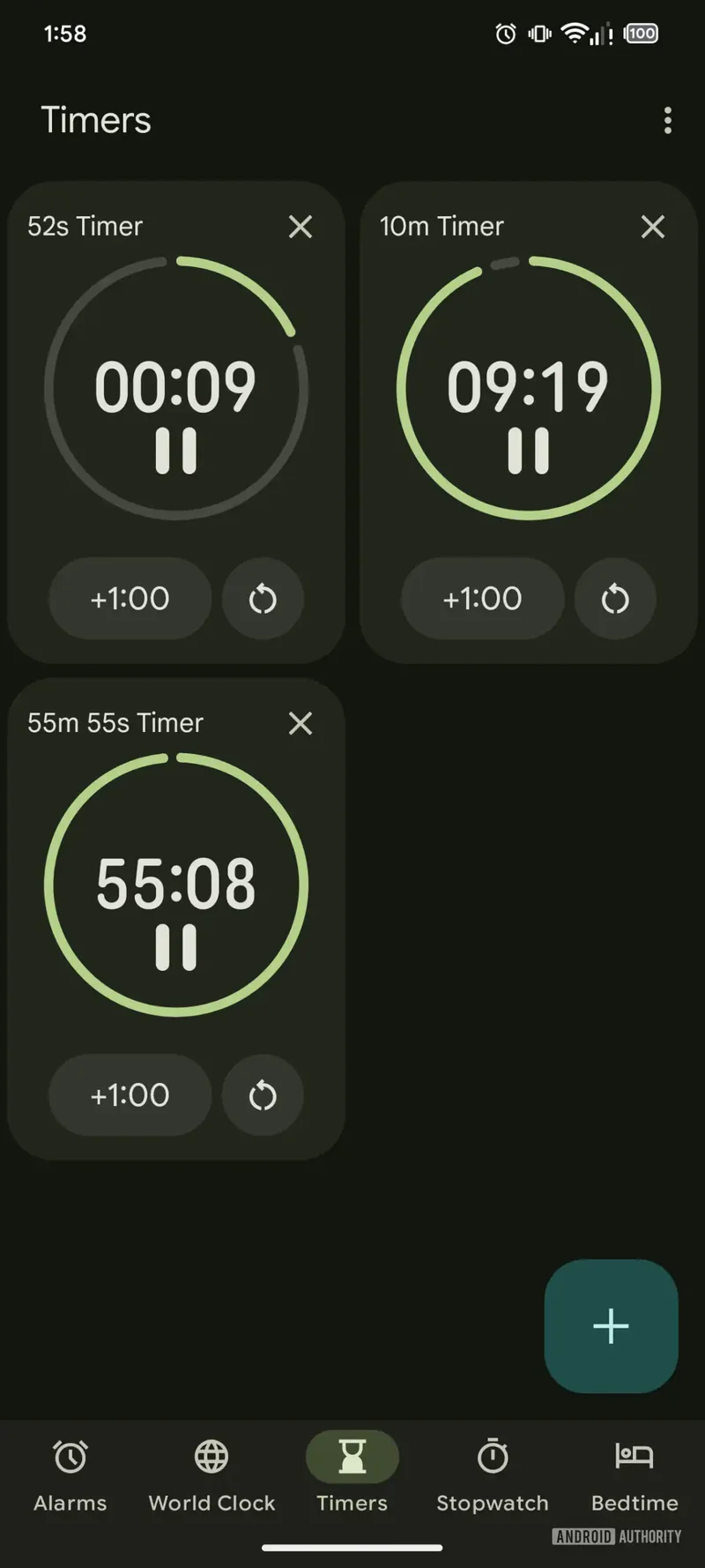
Google’s Clock app has just received a fresh makeover, and this time, it’s part of the Material 3 Expressive redesign initiative. 
If you’re a fan of modern aesthetics and smoother usability, you’re in for a treat.
Material 3 Expressive has been rolling out across Google’s native apps, and the Clock app’s recent update to version 8.1 is a shining example of how design changes can enhance your experience. The update doesn’t just refresh the looks; it brings some much-needed usability tweaks too. However, Android Authority has pointed out that a few features hinted at earlier are still absent from the final release.
One of the most noticeable changes is the new background for active alarms. This makes it instantly clear which alarms are set to go off and which ones are disabled, improving the overall user experience. The alarm setup screen is also revamped, with all the familiar options still in place – changing the alarm’s name, sound, active days, and a vibration toggle. But now, you also have a weather forecast toggle and an option to add an Assistant routine. Everything is neatly laid out for easy use.
Snoozing or turning off alarms is now simpler than ever. Gone is the old slider design; now, you get separate buttons for each option. Plus, when an alarm goes off, it will display your phone’s wallpaper rather than a plain background, adding a bit of flair to the experience.
Another major improvement is the stopwatch section. It now features much larger buttons for stopping, resetting, and lap timing, making it much more user-friendly, especially for those with larger fingers or when you’re in a rush.
However, one aspect that’s still a work in progress is the Timers section. Although Android Authority managed to uncover an experimental version that includes larger fonts, buttons, and improved organization, it hasn’t made it to the official release just yet. This update would be a great addition, especially when you’re juggling multiple timers.
Despite this, the overall redesign brings the Clock app closer to perfection. It’s fast, functional, and a lot more pleasant to use than before. As one of the most used native apps, Google’s update is certainly a step in the right direction, making it more intuitive and enjoyable. Now, if only the Timers section could get its final polish, we’d have the perfect Clock app on our hands.
Looking ahead, the buzz surrounding Google’s Material 3 Expressive overhaul is only growing. With the Pixel 10 on the horizon, this redesign makes me even more excited for what’s to come, especially when compared to Apple’s Liquid Glass aesthetic on the iPhone 17.
Exciting news for tech lovers! We’re gearing up to release a new coffee table book, Iconic Phones: Revolution at Your Fingertips, this fall. It’s a deep dive into the most iconic smartphones of our time. Stay tuned for early bird discounts!
3 comments
Anyone else think this design makes the Clock app feel way too fancy? I miss the old simple one
This update looks pretty cool but I was hoping for more from the Timers section. Oh well
The stopwatch buttons are WAY better now, big thumbs up for that. 👍