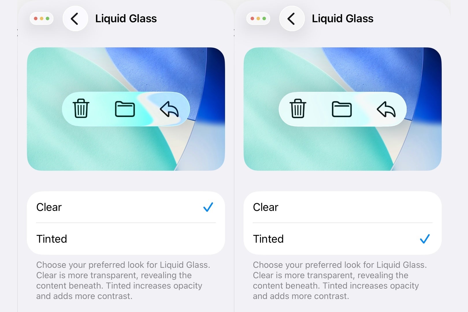
Apple’s latest aesthetic shift, dubbed “Liquid Glass,” arrived with iOS 26, iPadOS 26, and macOS Sequoia to much fanfare – and some frustration. The ultra-transparent, almost ethereal interface was designed to make Apple’s software look like it was made of light and motion. Yet for many, it went a little too far. 
The see-through menus and blurred panels looked stunning in press shots but proved distracting or even impractical in daily use. Thankfully, Apple seems to have taken the criticism seriously. The newest developer beta – iOS 26.1 beta 4 – introduces a long-requested option: the ability to tone down that shimmering glass effect with a simple toggle called ‘Tinted’.
For years, Apple’s design philosophy has balanced minimalism with flair. The Liquid Glass era took that to an extreme, making the entire operating system feel like it was floating in translucent layers. Now, users can finally add a little solidity back to their screens. The new toggle doesn’t hide the design altogether; instead, it adds subtle opacity and contrast, offering a look that feels more grounded and easier on the eyes.
To access it on an iPhone or iPad, head to Settings > Display & Brightness > Liquid Glass. On a Mac, you’ll find it under System Settings > Appearance > Liquid Glass. There you’ll see two simple options: ‘Clear’ and ‘Tinted.’ The former is Apple’s original, hyper-transparent aesthetic, while the latter introduces a gentle veil over the interface, improving readability without abandoning the overall look. Apple describes it succinctly: “Tinted increases opacity and adds more contrast.” It’s a small change with big implications, and crucially – it applies system-wide, from Apple’s own apps to third-party ones that embrace Liquid Glass.
It’s easy to see why users demanded this feature. On paper, Liquid Glass was futuristic. In practice, it sometimes clashed with wallpapers or made notification banners hard to read. For people who prefer clarity over visual theatrics, the transparency could feel overwhelming. The new option restores balance, acknowledging that good design isn’t just about showing off – it’s about usability too.
Interestingly, this move also reveals a subtle divergence between Apple and Google’s design philosophies. While Google’s Material You framework emphasizes personal color theming – using wallpaper hues to tint buttons, icons, and menus – Apple went the opposite route, prioritizing texture and translucency. But now, by introducing the “Tinted” option, Apple seems to be admitting that its vision of a unified, glassy interface doesn’t suit everyone. It’s not a retreat, exactly – it’s a refinement.
From an accessibility perspective, this is also a smart adjustment. Increasing opacity improves contrast ratios, which helps users with vision sensitivities. It also makes text and UI elements more legible against complex backgrounds. For many, this isn’t about aesthetics at all – it’s about comfort and usability during long hours of screen time.
The update also highlights a growing theme in Apple’s software evolution: flexibility. For a company once known for strict design uniformity, giving users more control marks a philosophical shift. “Clear” might be the showcase mode – the one you flaunt in a keynote or ad – but “Tinted” feels like the real-world mode you’ll want day to day.
With iOS 26.1 expected later this month, the timing couldn’t be better. Apple’s willingness to respond quickly to feedback, especially from the beta community, shows that the company is listening. It’s a small but meaningful win for personalization and practicality – proof that even in Apple’s polished world, a little user feedback can still change the picture.
So if the Liquid Glass interface has been dazzling you in all the wrong ways, you’ll soon have a calmer, more readable experience just a tap away. Sometimes, it turns out, less transparency means more clarity.
1 comment
This update makes iOS 26 actually usable again!