The latest collaboration between TAG Heuer and Fragment Design doesn’t tiptoe into the room – it kicks the door open with a slab of monochrome minimalism. The new TAG Heuer Carrera Chronograph x Fragment Limited Edition takes the brand’s already distinctive 39 mm Glassbox Carrera and strips it down to something almost architectural: sharp contrasts, brutalist textures, and a defiantly fashion-forward attitude. 
It is still very much a Carrera at heart, but it is also a statement about where modern luxury watchmaking increasingly lives – somewhere between serious horology and streetwear culture.
This is not the first time TAG Heuer and Fragment have crossed paths. The Japanese streetwear label, led by Hiroshi Fujiwara, has been reworking TAG Heuer designs since 2018, most notably on previous Carrera and Formula 1 collaborations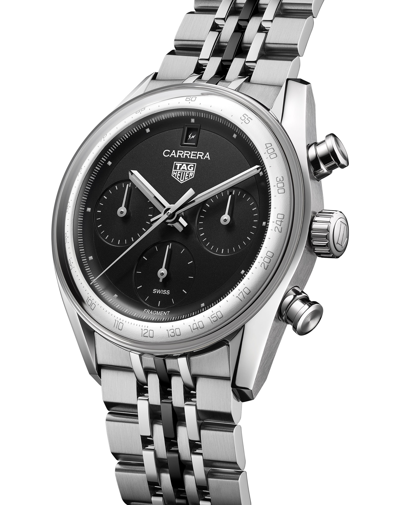
. Each project has dialed into a particular slice of Heuer history and then pushed it through a contemporary, monochrome filter. With this new limited edition, the partnership returns to the Carrera line and to the now-famous Glassbox case, but with a bolder, more elemental interpretation than ever before.
Case and the Glassbox silhouette
On paper, the case of the Carrera Chronograph x Fragment Limited Edition will look familiar to anyone who has tried on the modern Glassbox models. 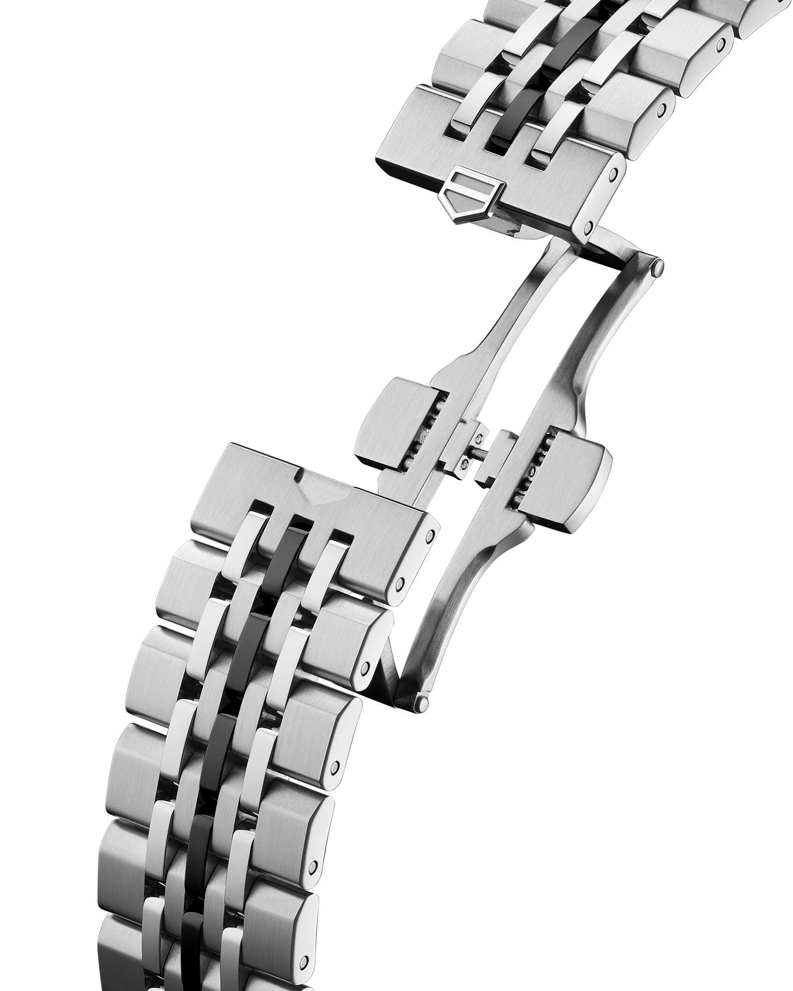
It keeps the 39 mm stainless steel diameter, moderate thickness, and those recognisable inward-angled lugs that reference vintage Carreras from the 1960s. The broad piston pushers and sturdy crown remain reassuringly old-school tool-watch in feel, while the polished chamfers along the case flank catch the light and remind you this is still a piece of luxury metalwork.
The star of the show, however, is once again the Glassbox sapphire crystal. Instead of a conventional bezel, the fully domed crystal sweeps from edge to edge in one smooth curve, giving the watch a Jetsons-era, retro-futuristic profile. Seen from the side, it almost looks like a snow globe of matte black and grainy white, with the dial pressed right up against the surface. It is one of the most recognizable silhouettes in contemporary watch design, and on this model the high contrast dial makes that dome even more dramatic.
Flip the watch over and the fundamentals remain practical and reassuring. A sapphire display back shows off the movement while preserving a respectable 100 meters of water resistance – more than enough for everyday wear, even if no one is taking this particular Carrera on a dive holiday. The caseback gets a Fragment twist via the double lightning-bolt logo printed on the glass, but the architecture and robustness are unchanged from the standard Carrera Glassbox.
A dial that chooses attitude over compromise
Where this watch really declares its intentions is on the dial. TAG Heuer and Fragment have taken the already clean Carrera layout and stripped it back even further, removing many of the visual cues that traditionalists rely on. The result is a dial that looks like it was designed in a graphic studio rather than an engineering lab – and that is very much the point.
The most immediately noticeable decision is the removal of the polished faceted hour indices. In their place you get tiny, pale gray printed squares that barely interrupt the dark dial surface. They do their job functionally, but only just; they are there to whisper, not shout. This pushes your attention toward the polished split baton hands, which suddenly feel like jewellery suspended over a flat, almost industrial canvas. On wrist, these hands are likely to be the main source of shimmer and visual motion, catching the light as the rest of the dial absorbs it.
The three chronograph subdials – positioned at 3, 6, and 9 o’clock – are perhaps the most divisive aspect of the design. In place of numerals, you have stark, minimalist scales printed in pale gray, with no obvious hierarchy or bold accents to help you read elapsed time at a glance. For enthusiasts who actually time things, this will feel like a compromise in the name of aesthetics. It absolutely can be read, but it demands more effort than a traditional tool chronograph. For others, especially buyers who rarely touch the pushers, this reduction is exactly what makes the watch feel sleek and uncluttered.
The date display has also been rethought in a way that will delight some and baffle others. The conventional 6 o’clock date aperture is gone; instead, the date moves to 12 o’clock, framed by a simple matte black surround that integrates into the dial rather than drawing attention to itself. It is a subtle rebalancing of the dial that adds a sense of vertical symmetry, while the Fragment lightning motif makes a cameo on the date wheel itself. TAG Heuer keeps the exact placement of that logo as a surprise, which feels suitably playful for a streetwear-infused collaboration.
Chapter ring, textures, and the pseudo-bezel effect
The modern Carrera’s double-sided chapter ring – a wave-like structure that rises to meet the Glassbox crystal – is reimagined here as an important part of the watch’s personality. Instead of a single color that blends into the dial, the outer portion of the ring is rendered in a grainy matte white, while the inner dial stays dark. This contrast visually compresses the dial and creates the illusion of a white bezel floating under the crystal, echoing the look of vintage racing chronographs but with none of the traditional bezel hardware.
The tachymeter scale, printed in pale silver along this white ring, remains fully functional in theory, but in certain lighting it will melt into the background, reinforcing the sense that this is as much an art object as a timing instrument. That will frustrate purists who want every marking to shout its presence, yet for design-driven buyers the subtlety is part of the appeal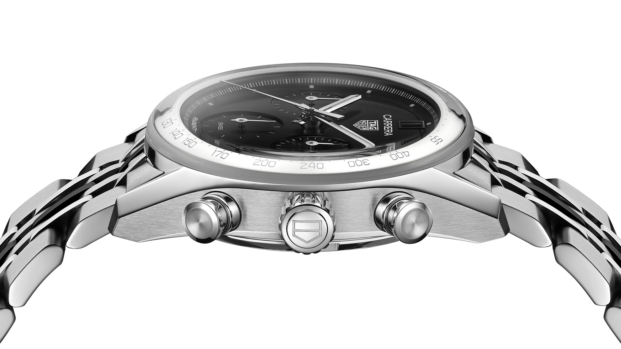
. It reads more like typography in a magazine layout than instrumentation on a dashboard.
Across the rest of the dial, TAG Heuer leans into heavy-grain matte finishes. The main surface and the recessed subdials share the same texture, ditching the classic circular azurage that typically gives chronographs visual depth. This unified, almost concrete-like finish gives the watch a brutalist vibe – stark, deliberate, and slightly cold. It is a watch that looks purposefully designed rather than nostalgically romantic, closer to a modern monochrome sneaker collaboration than a rose-tinted remake of a 1960s reference.
All of this has made the design highly polarizing. Some will see an under-legible, over-priced fashion piece that sacrifices usability in favour of mood. Others will see a carefully curated object where every distraction has been edited out, leaving only form, light, and shadow. Both readings are valid, and that tension is exactly what makes this collaboration interesting.
The TH20-00 movement: real mechanics behind the fashion
Underneath the monochrome theatre, TAG Heuer has not skimped on the mechanics. Inside the Carrera Chronograph x Fragment Limited Edition beats the in-house TH20-00 automatic chronograph calibre. This is not a lazy choice or an off-the-shelf movement; it is a modern engine with specifications that match, and in some ways exceed, what you would expect at this price point.
The TH20-00 runs at 28,800 vibrations per hour and offers a robust 80-hour power reserve, which comfortably covers a long weekend off the wrist. It uses a column wheel and vertical clutch, the preferred combo for enthusiasts who care about a crisp pusher feel and minimal hand jump when starting the chronograph. These technical choices mean that, beneath the stripped-back dial, this is still very much a serious chronograph.
Through the caseback, the movement presents a mix of industrial cleanliness and light decoration. The partially skeletonised three-quarter plate carries broad Côtes de Genève stripes, while the rest of the architecture is relatively understated and modern. The shield-shaped rotor – a TAG Heuer signature – is opened up and given a bold black graphic treatment to echo the fragment branding on the crystal above. Interestingly, TAG Heuer forgoes the colourful column wheel it often uses on other models, instead leaving it in plain polished metal, which fits the monochrome brief even on the hidden side of the watch.
Bracelet and on-wrist presence
Completing the package is a contemporary take on the classic Carrera bracelet. TAG Heuer uses its modern seven-link steel design, which riffs on the old beads-of-rice style but sharpens every edge and facet. The result is a bracelet that feels dense, architectural, and very much in line with the watch’s overall design language.
The Fragment edition adds its own twist to this familiar formula by giving the narrow raised central link a black coating. It is a surprisingly small change that has a surprisingly big impact. From a distance, the bracelet reads almost like a subtle two-tone piece, breaking up the field of polished steel with a dark stripe that picks up the dial color. Up close, the alternating textures and finishes create a sense of depth and movement as the bracelet flexes around the wrist.
On wrist, the combination of compact 39 mm diameter, domed crystal, and relatively thick mid-case creates a watch that can feel both smaller and chunkier than expected, depending on your perspective. Some will find the proportions charming and vintage-leaning; others will see a case that wears a bit like a stylish steel puck. What is clear is that this is not a shy watch. The stark white ring, towering crystal, and black-striped bracelet make sure it is seen across a room, even if the subdial scales are hard to see across a desk.
Price, audience, and the question of longevity
With a limited run of 500 pieces and an official price of 8,150 CHF (roughly around the 9,000 USD mark at current rates), the Carrera Chronograph x Fragment Limited Edition is not trying to be everyone’s daily driver. It is aimed squarely at collectors who appreciate both contemporary design and brand storytelling: buyers who know who Hiroshi Fujiwara is, who care about the lineage of the Carrera, and who are comfortable paying a premium for a collaboration that blurs the line between fashion and horology.
That price will inevitably trigger debate. Many enthusiasts will point out that for the same money you can buy a more legible, more traditional chronograph from competing brands, or even from TAG Heuer’s own catalogue. Others will look at the in-house movement, the limited production run, the design pedigree, and the strength of the Glassbox platform and decide the number – while ambitious – can be justified. The truth probably sits somewhere in the middle: this is not a value proposition in the classic sense, but it is also not an empty fashion shell riding on a logo.
The bigger question is how well this design will age. Some will argue that its stark minimalism and monochrome palette will feel dated once the current wave of stripped-back, fashion-centric luxury cools off. They picture the watch living a brief honeymoon on the wrist before spending years in the back of a watch box, occasionally brought out as a curiosity from a specific era. Others believe that, precisely because it leans so hard into a clear visual identity, it will stand as an interesting snapshot of where TAG Heuer and the broader watch culture were at this moment – and that decades from now it will still feel cohesive, even if the trend winds have shifted.
Verdict: a polarising, confident collaboration
The TAG Heuer Carrera Chronograph x Fragment Limited Edition is not a watch that tries to please everyone. It deliberately sacrifices some legibility and traditional chronograph ergonomics in favour of a sharp, graphic presence and a conceptually consistent aesthetic. For some enthusiasts, especially those who view the chronograph as a tool first, that will be a deal-breaker. For others, particularly collectors who see watches as wearable design objects and cultural artefacts, this collaboration may be one of the most compelling Glassbox Carreras yet.
What cannot be denied is that the watch feels intentional. From the tiny printed hour squares to the relocated date, from the grainy matte textures to the white pseudo-bezel and black-striped bracelet, every element pushes the same idea: this is a chronograph that has chosen attitude over compromise. Whether you interpret that as bravely focused or frustratingly decorative will ultimately decide if this limited edition belongs in your box – or just in your bookmarks.
2 comments
Love the whole monochrome + streetwear vibe, actually think TAG and Fragment nailed the mood. But if they’re gonna go this minimal on the dial, they could’ve at least gone minimal on the price too
Glassbox looked awesome in pics to me, then I saw another version in person and it felt tiny but also thick, almost like a little steel puck. Curious how this one wears with that bright ring