
A Jubilee Collaboration That Paints Time In Primary Colors
Anniversary years tend to bring out the sentimental side of watch brands, but retailers also have stories to tell. For its 50th birthday in 2025, Amsterdam-based Ace Jewelers decided not to throw a quiet party, but to paint one on the dial of a British watch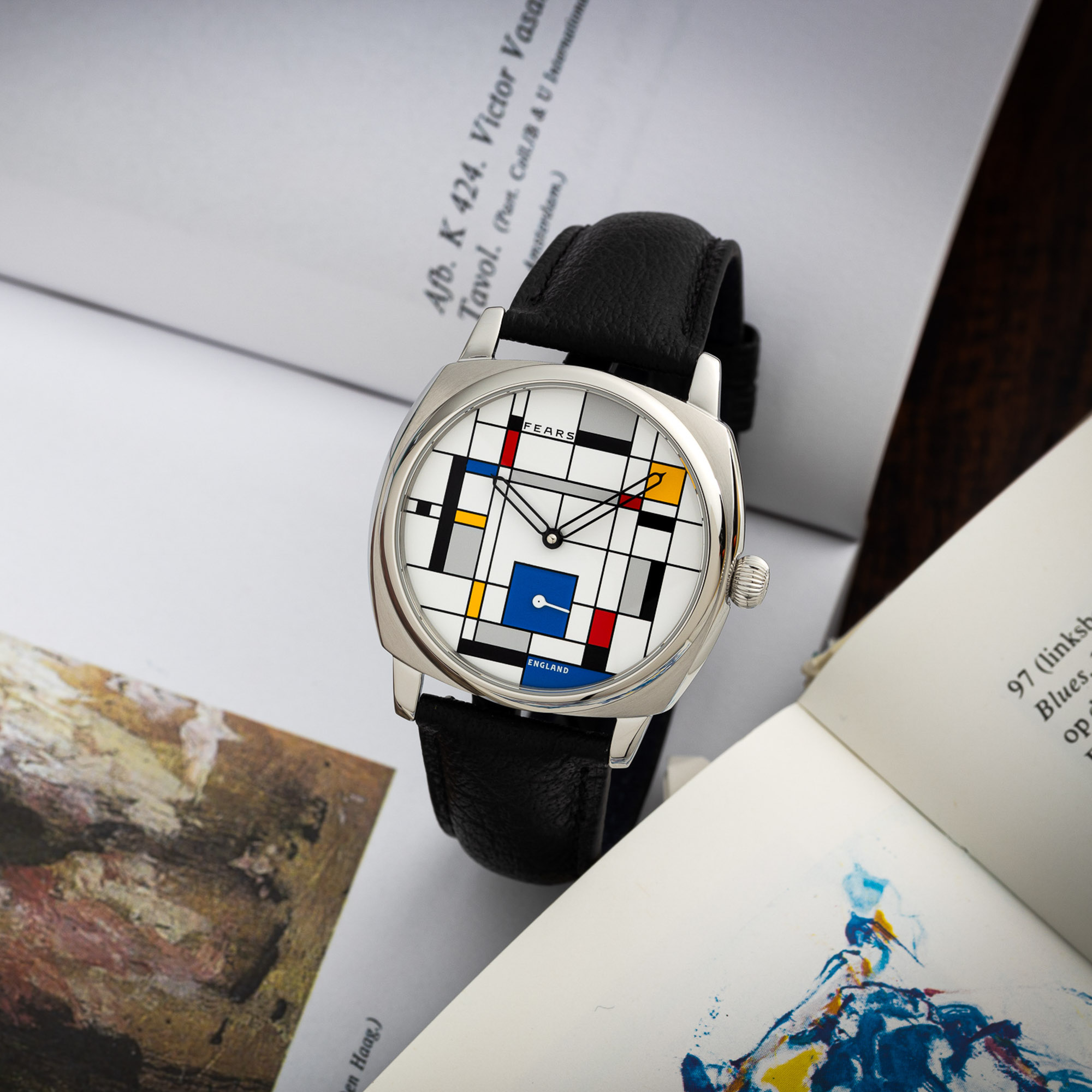
. The result is the Ace Jewelers x Fears Brunswick 38 ‘De Stijl’ Edition, a 50-piece limited run that turns the minimalist language of the Dutch De Stijl art movement into a surprisingly functional wristwatch.
This is not Ace’s first flirtation with the movement founded by Piet Mondrian and his contemporaries. In 2017 the retailer marked the centenary of De Stijl with the Ace x Nomos Orion ‘100 Years De Stijl’, a collaboration that smuggled Mondrian’s aesthetic into the hour markers of an otherwise restrained German dress watch. 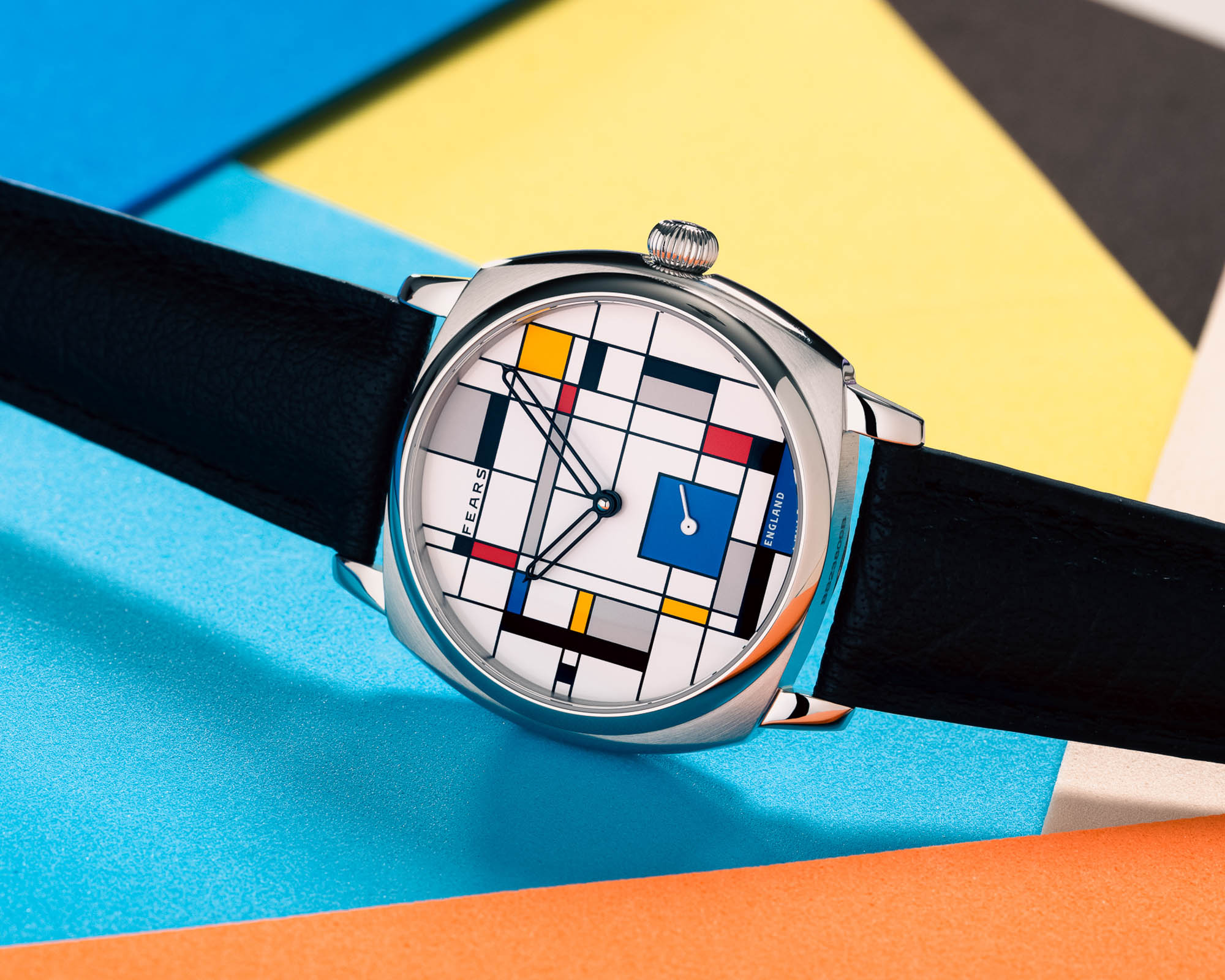
The new project with Fears flips that concept on its head. Instead of a conventional dial accented with a few playful details, the entire face of the Brunswick 38 has been reimagined as a Mondrian-style composition where the hour markers are hidden in plain sight.
De Stijl On The Wrist: From Art School Walls To Everyday Design
Even if you have never heard the name De Stijl, you have almost certainly met its visual vocabulary. Think vertical and horizontal black lines creating a grid of rectangles, some of them filled with bright primary red, yellow, or blue, others left white or muted grey. The paintings of Piet Mondrian have escaped the gallery and colonised streetwear, interior design, tech logos, furniture and advertising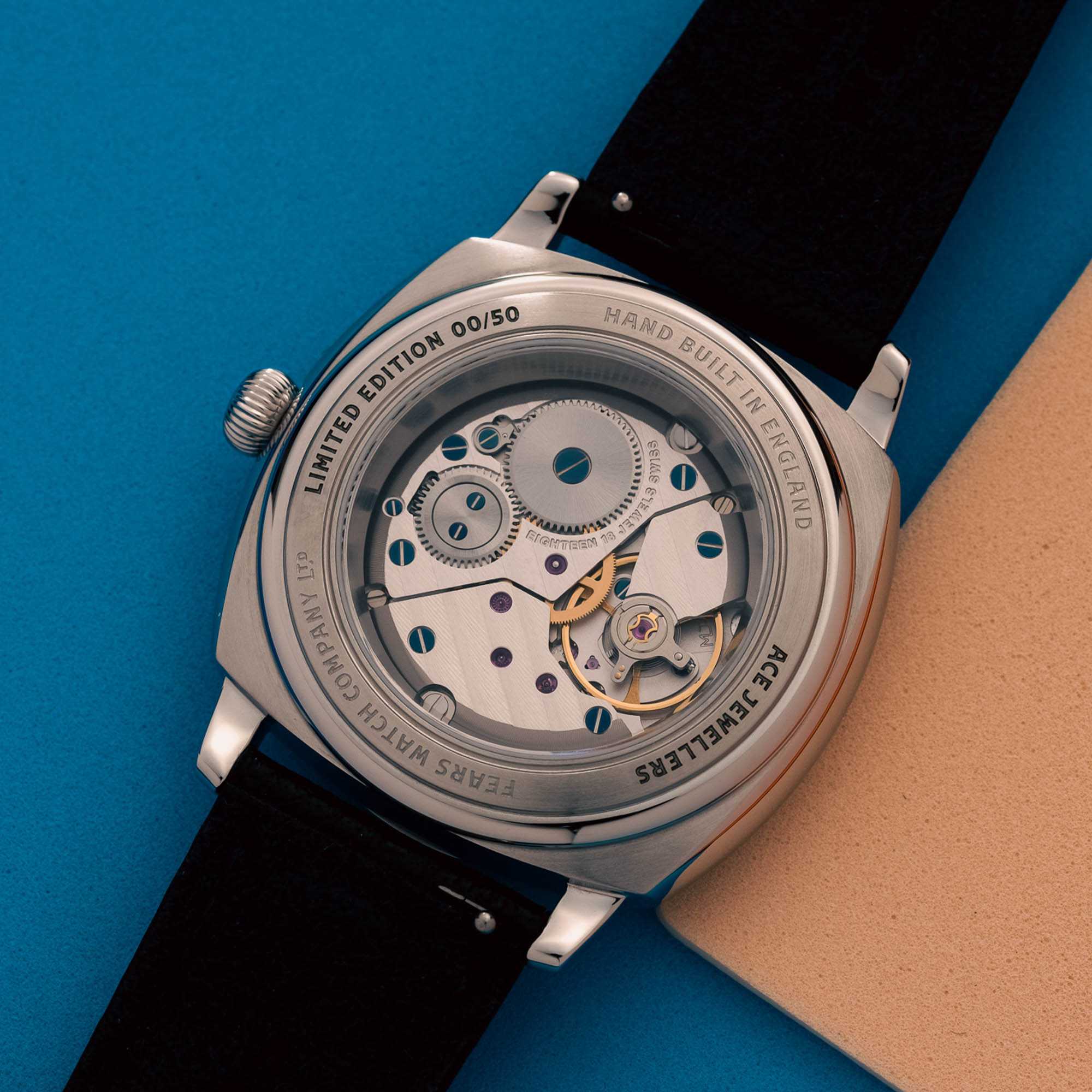
. It is one of those rare styles that looks so familiar that many people do not even realise it started as a radical artistic manifesto.
That cross-over into everyday life is precisely what makes De Stijl such fertile ground for a watch collaboration. A watch dial is, after all, a tiny canvas that sits on the wrist instead of on a wall. You catch it in fleeting glances, never for very long, and yet it has to communicate clearly. Take the grid-and-color language of Mondrian, shrink it to 38 millimetres, and the question becomes: can you still read the time without turning your wrist into a puzzle?
Some enthusiasts will look at the Brunswick 38 ‘De Stijl’ and immediately think, too much, dismissing it as an overcooked novelty. Others will see a familiar palette that faintly recalls colourful Rolex enamel and Stella-style dials without copying anything directly. That tension between playful art object and serious watch is the tightrope Ace and Fears have chosen to walk.
The Brunswick 38 Canvas: Compact, Versatile, And Properly Built
Beneath the artwork there is a very real, very considered watch. The starting point is Fears’ flagship Brunswick 38, a cushion-shaped case that has become the modern face of the historic British brand. 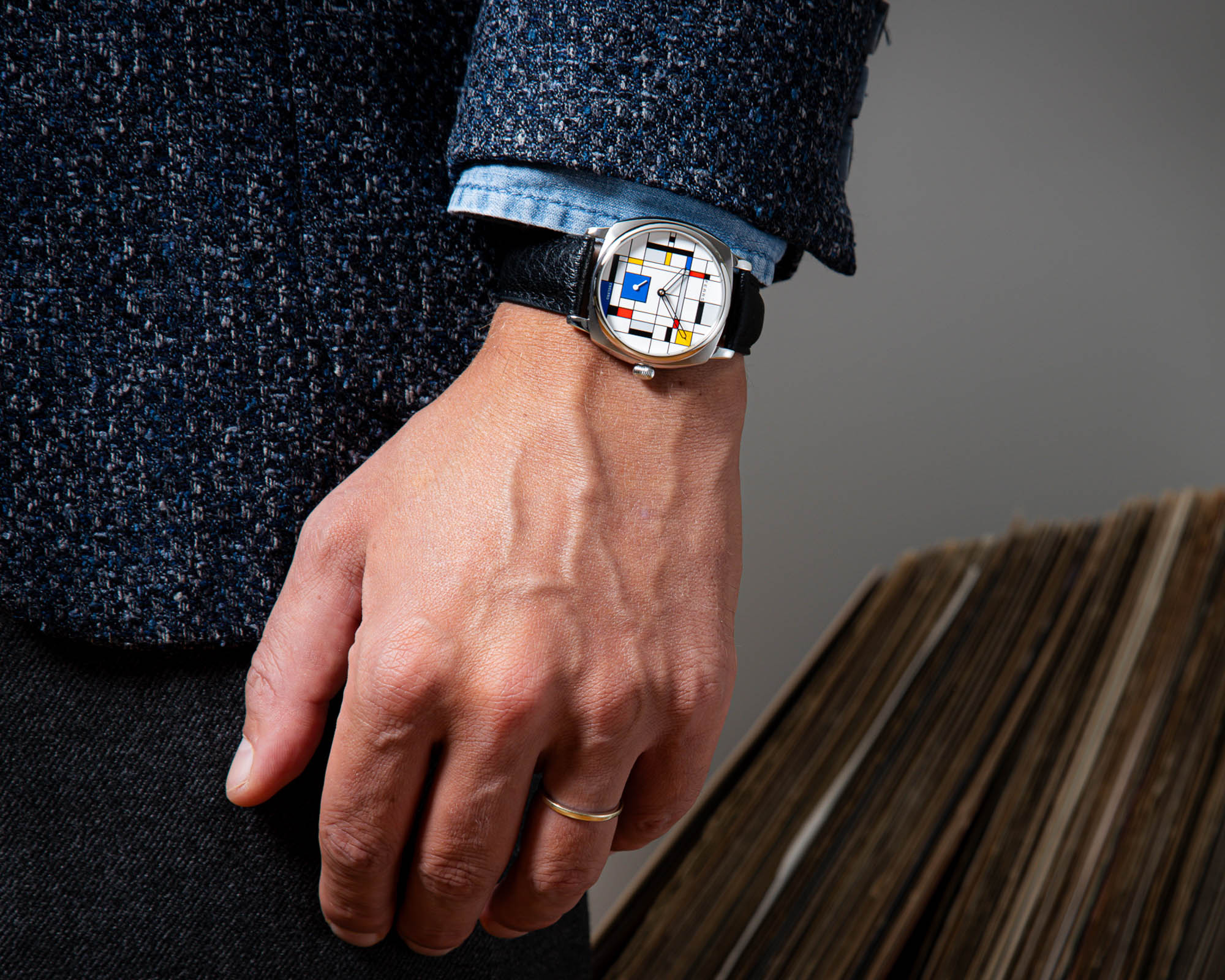
Here it is rendered in brushed and polished 316L stainless steel, measuring 38 millimetres across and 11.69 millimetres in thickness including the tall domed sapphire crystal. Those numbers put it squarely into the sweet spot for contemporary unisex sizing.
Lug-to-lug, the watch stretches 48 millimetres, which gives the piece some presence without overwhelming slimmer wrists. The lugs are 20 millimetres apart, a standard width that makes strap swapping effortless; a smart move for a watch whose dial is already doing the heavy lifting in terms of personality. Water resistance is rated to a very practical 100 metres. You are not expected to take a Mondrian painting diving, but it is comforting to know that this colourful dial can handle a rainy Amsterdam commute or an accidental splash.
Unlike the standard Brunswick 38, which can be ordered with either a closed or transparent caseback, the Ace Jewelers x Fears Brunswick 38 ‘De Stijl’ is delivered exclusively with a sapphire display back. Around the rim, each of the 50 pieces is individually numbered, underscoring that this is not just another dial variant, but a small-batch celebration of Ace’s half-century in business.
Inside The Frame: A Slim Swiss Hand-Wound Movement
Through the sapphire window beats a movement whose architecture has quietly earned the respect of watchmakers for decades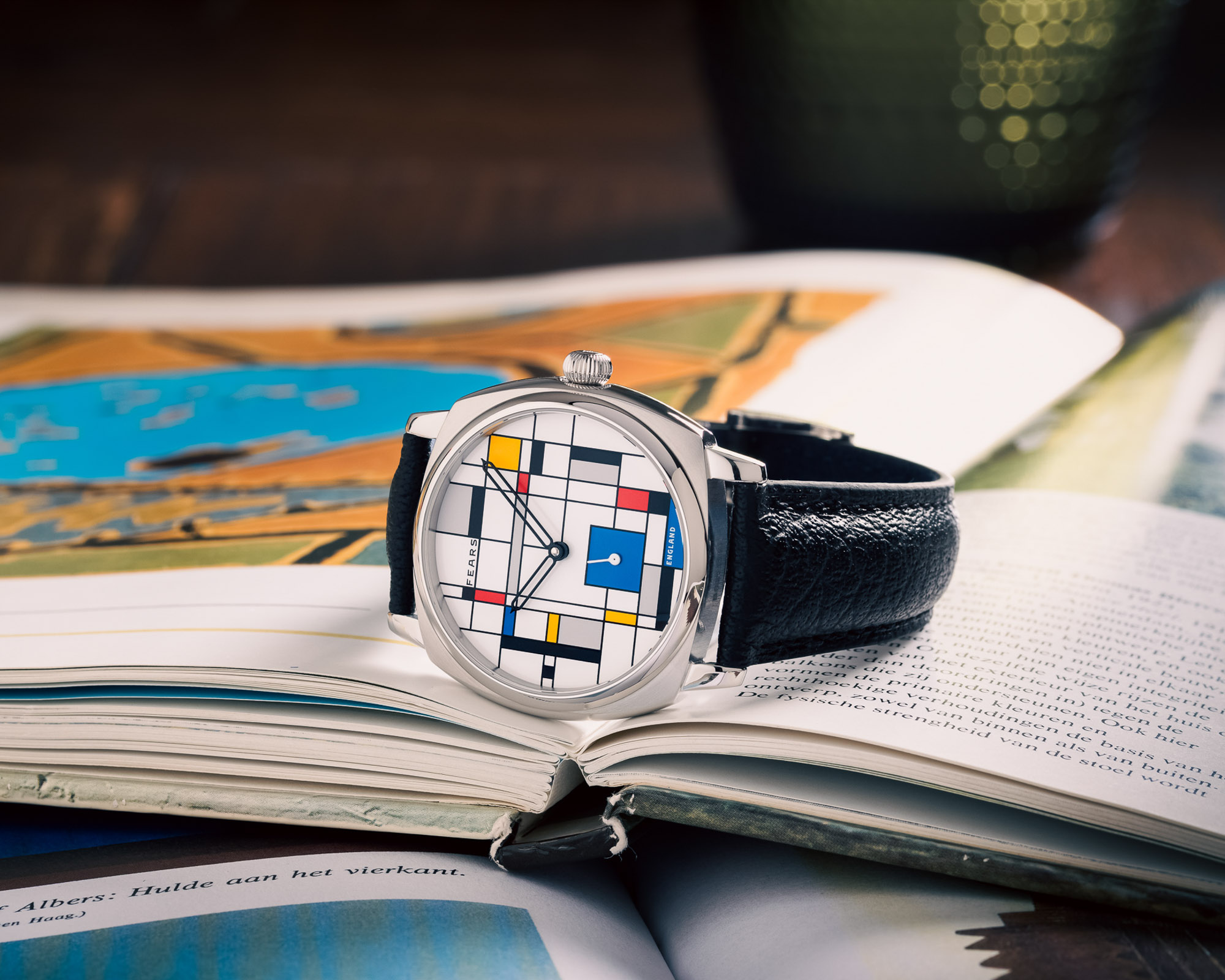
. Fears has chosen the manually wound La Joux-Perret Calibre D100, a modernised descendant of the slender ETA/Peseux 7001. In this execution it remains a time-only engine with small seconds, ticking away at 21,600 vibrations per hour.
The D100 offers a healthy power reserve of around 50 hours, meaning you can set the watch down on Friday evening and still find it running on Sunday. Hand-wound movements have a way of deepening the bond between owner and watch, and in a piece that already leans so heavily into the idea of the wrist as a gallery space, that daily ritual of winding feels fitting. It is the horological equivalent of stepping back from the canvas and taking another look.
Finishing on the D100 is clean and modern rather than baroque, which again suits the De Stijl theme. You see crisp bridges, neat machining, and the reassuring sense that this is a movement designed to be worn and serviced rather than simply admired once through a loupe and then forgotten.
A Dial That Doubles As A Puzzle
The real show, of course, happens on the front. At first glance the dial appears to be a random arrangement of lines and coloured blocks in red, blue, yellow, grey and black. Look more closely and you realise there is nothing accidental about it. Every line and every block has been placed to serve the twin masters of art and legibility.
The thick blue square that dominates the lower half of the dial is not just a bold splash of colour; it is the sub-dial for the running seconds, with a small hand sweeping around inside the blue field. The black squares at the periphery have their corners carefully aligned with the positions where conventional hour markers would normally sit. Instead of applied indices or printed numerals, you get an abstract constellation of right angles that secretly anchor the hours.
Once your eye learns the pattern, you can read the time more quickly than sceptics might assume. There is no printed minute track and no attempt to let you time a soufflé to the exact second; this is a watch for approximate minutes, not for laboratory work. Several collectors will inevitably grumble that a dial which occasionally asks for a second glance is a fatal flaw. Others will argue that an art watch that still lets you tell the time at all is already ahead of much of the category.
And that is where this Brunswick 38 lands: it is far from the most legible watch Fears has ever produced, yet it makes a genuine effort to keep the essential function intact rather than simply plastering an artwork over the top. The dial is whimsical, polarising, and arguably a bit mad, but it is not lazy.
Love It Or Hate It: The Enthusiast Debate
Scroll through the reactions from early photos and you will find the full spectrum of responses. On one end are traditionalists who usually admire Fears but simply cannot get past this dial. For them, the grid of colours is a step too far, a loud canvas sitting on top of an otherwise refined case. A few go further, calling it an expensive novelty that will become tiresome the moment the honeymoon period is over.
Price inevitably enters the conversation. At 3,400 euros excluding VAT, which converts to roughly 3,940 US dollars at the time of launch, this is not pocket change. Critics look at the lack of a minute track, the minimal complication count and the limited ability to read precise seconds and wonder why they should spend that much on what they describe as barely legible art. For them, any watch that requires a diagram to explain how to read it is an automatic no.
On the other side are collectors who have grown bored of conservative designs and see this piece as a rare burst of personality in a sea of monochrome dials. They point out that, for daily use, an approximate reading of the minutes is entirely sufficient, and that the Mondrian-inspired layout becomes intuitive with a bit of wrist time. Some praise the playful colour combination for giving off a subtle vintage-luxury vibe without borrowing directly from any one historic model. Others simply smile and admit that it makes them happy, which is not a bad metric for a discretionary purchase.
Ace Jewelers And The Art Of The Collaboration
The ‘De Stijl’ Brunswick slots neatly into a growing family of collaboration pieces that Ace has curated over the past decade. Rather than endlessly remixing the same formula, the retailer has built a reputation for commissioning small runs with very different brands and aesthetics. Earlier projects have ranged from fiery orange-dial takes on the Nomos Metro to a Christopher Ward whose dial leans into Hebrew typography. Each of these watches starts from a core-collection model and nudges it into territory that would probably be too niche for a mainstream release.
What unites them is a consistent philosophy: these special editions are priced on par with their standard siblings. The Ace Jewelers x Fears Brunswick 38 ‘De Stijl’ Edition follows that rule, coming in at the same level as comparable Brunswick 38 references in the catalogue. For collectors this removes one of the usual barriers to limited editions, namely the feeling that you are paying a heavy premium for a different dial colour and a number out of fifty.
It also underlines Ace’s identity as an enthusiast-focused, multi-brand retailer. The shop floor is filled with regular, non-limited pieces from the brands it represents, but these collaborations give Ace a distinct voice. For the brands involved, it is a way to experiment without committing to permanent catalogue entries. For buyers, it is an opportunity to pick up fan-favourite models in guises that may never appear again.
Who Is This Watch Really For?
The simple answer is that the Ace x Fears Brunswick 38 ‘De Stijl’ Edition is not aimed at everyone, and that is entirely the point. Its production run of 50 pieces makes it numerically rare, but the design itself is even more selective. 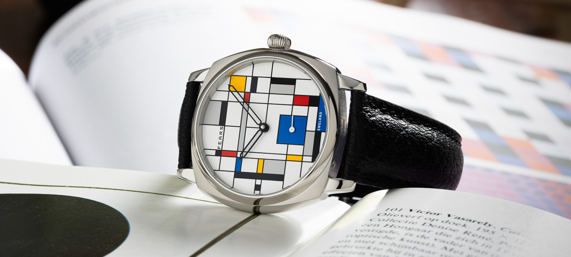
If your idea of the perfect watch is a sterile three-hander with endless legibility and zero whimsy, this piece will likely feel like an affront.
If, however, you are drawn to watches that sit somewhere between accessory and art object, this collaboration becomes much more interesting. It is easy to spend far more money on a so-called statement watch whose impact fades after a few weeks on the wrist. Here you get a thoughtfully engineered case, a tried-and-tested Swiss hand-wound movement, and a dial that will probably continue to split opinions every time you roll up your sleeve.
As a daily wearer, it might be a stretch for many owners; as part of a small collection, rotated into the line-up when you feel like bringing a bit of playful colour to your day, it makes a lot more sense. In that context the slightly indulgent price begins to look more like the cost of owning a tiny slice of De Stijl history, filtered through two companies who clearly enjoy speaking to design-conscious collectors.
Final Thoughts: A Tiny Gallery For The Wrist
In the end, the Ace Jewelers x Fears Brunswick 38 ‘De Stijl’ Edition succeeds precisely because it is willing to be divisive. It refuses to be another safe anniversary piece with a commemorative caseback engraving and a special box. Instead it takes a century-old art language and asks what happens when you fold it around a cushion-shaped case and insist that it still function as a watch.
For some that answer will be a hard pass, for others a grin and a quick message to Ace before all fifty are spoken for. Either way, this collaborative Brunswick proves that there is still room in modern watchmaking for designs that make people argue, laugh, and occasionally reach for a diagram. That, in its own small way, feels very true to the disruptive spirit of De Stijl.
1 comment
Interesting piece, unique and kinda charming, just wish it had a simple minute track so my brain doesn’t need a diagram every time 😅