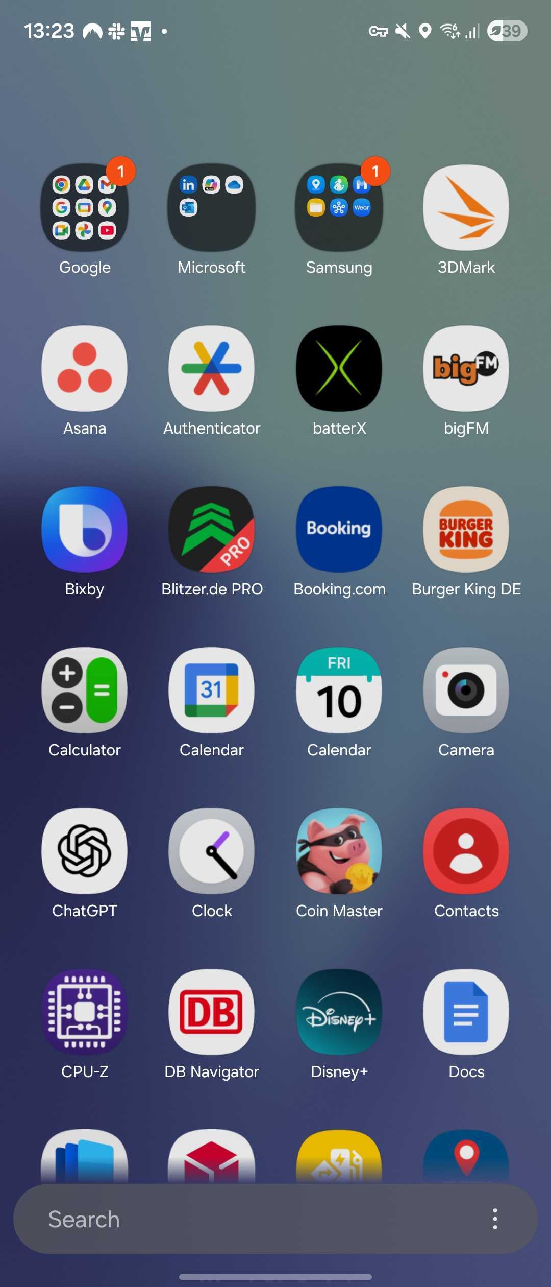
Samsung’s One UI 8.5 is shaping up to be more than just another iteration – it’s a careful refinement of how Galaxy users interact with their devices every day. Among the subtle but significant design changes emerging from recent test builds, the new app drawer stands out for its sleeker, more professional look. 
The redesigned search bar, now narrower and tinted in white, floats elegantly over the app grid, giving the interface a sense of lightness and precision that the older, wallpaper-colored bar lacked.
Based on Android 16, One UI 8.5 is Samsung’s next big software step, expected to debut officially with the Galaxy S26 lineup in February 2026. Early leaks, including the one spotted last month on the Galaxy S25 Ultra, hinted at deeper visual polish and smoother transitions. However, newer builds continue to reveal how far Samsung’s design team is pushing consistency and usability. The refined app drawer is just one piece of a broader visual overhaul that signals the company’s desire to make One UI feel more cohesive and timeless.
In earlier versions, Samsung’s app drawer search bar stretched across the entire width of the screen, blending with the wallpaper beneath it. While colorful, it often clashed with certain backgrounds and looked slightly dated next to minimalist Android skins from competitors. In One UI 8.5, the search bar’s new design introduces a sense of uniformity – its white, floating appearance contrasts subtly against the background, improving readability and focus. This simple shift in color tone and positioning gives users a cleaner entry point when searching for apps, aligning more closely with the modern design cues seen in Samsung’s Galaxy ecosystem.
These refinements join a set of other subtle aesthetic updates discovered in the same build. Icons now have a more pronounced 3D effect, giving them tactile depth, and the status bar’s icons have switched to black for better legibility against light wallpapers. Taken together, these details create a perception of visual maturity – Samsung isn’t just refreshing One UI’s look; it’s tightening its visual language, eliminating inconsistencies that users might not consciously notice but always feel.
The end result is an interface that feels fresh without losing its signature Galaxy identity. As Samsung continues to refine its Android 16-based software, it’s clear that One UI 8.5 isn’t about revolution – it’s about refinement. With each tweak, Samsung brings its design philosophy closer to the ideal of effortless usability wrapped in understated elegance, preparing users for a polished experience when the Galaxy S26 finally lands next year.
1 comment
I hope it doesn’t slow down older phones again..