Samsung is preparing to refine the visual experience on its Galaxy devices once again with the upcoming One UI 8.5 update, bringing a series of subtle yet meaningful aesthetic upgrades. After the sweeping design overhaul of One UI 7 and the restrained tweaks of version 8.0, the company is returning to the drawing board with a renewed focus on depth, light, and clarity. 
Insiders and leaks reveal that Samsung is experimenting with a more dimensional design language that will make the interface feel livelier and more tactile without sacrificing the clean look One UI is known for.
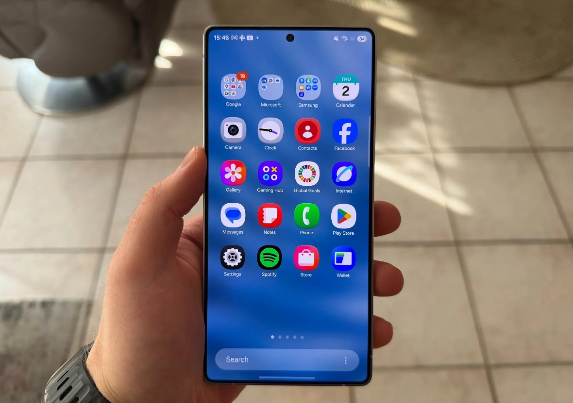
The most striking change spotted in early One UI 8.5 builds is the introduction of 3D-style app icons. These icons, rather than being flat and uniform, now seem to have layers that subtly rise from the background, producing a realistic shadowing effect. It’s a design direction reminiscent of physical icons from the early smartphone era but executed with modern precision and polish. Samsung appears to be refining this 3D concept build after build, shaping icons with smoother gradients, softened edges, and more defined contours. The Gallery and Studio app icons are early examples of this evolution – where petals and camera shapes seem to lift off the display, giving the illusion of touchable objects.
The leaked comparisons clearly show that One UI 8.5 makes icons more than just symbols – they now feel sculpted. The Gallery icon, for instance, features two distinct layers of petals that cast subtle depth shadows, while the Studio app icon separates its graphical elements from the background to enhance the perception of depth. Even though these are small tweaks at first glance, collectively they contribute to a more immersive and refined user interface that feels premium and cohesive.
What’s even more interesting is that this layered 3D approach has been extended across nearly all stock Samsung apps. Earlier One UI 8.5 test builds had limited these visuals to select applications like Camera, Messages, or Gallery. But the latest internal iterations reportedly apply this style system-wide. From the Clock to the Weather app, everything gets a gentle facelift that aligns with Samsung’s pursuit of a consistent, polished design ethos. Users who value aesthetic coherence across their devices will likely appreciate this unified design direction.
Beyond app icons, Samsung is also paying attention to smaller interface details – particularly the status bar icons. According to the latest screenshots, these icons (for Wi-Fi, cellular signal, sound mode, and battery indicators) are now thicker and slightly bolder, improving visibility at a glance. The company has found a balance between modern flatness and practical readability, making sure the new visuals look sleek on both small and large screens. In side-by-side comparisons with One UI 8.0, the difference might seem subtle, but the usability improvement is significant. Samsung’s design teams seem determined to make every pixel count.
Industry observers point out that this design shift also aligns with broader trends across Android skins and mobile operating systems. Apple, Google, and other OEMs are returning to more organic, depth-oriented design cues after years of ultra-flat minimalism. Samsung’s choice to adopt a semi-3D approach while maintaining visual discipline suggests the company aims to blend modern simplicity with visual warmth – giving Galaxy devices a more approachable personality without clutter.
The South Korean giant is still actively iterating on One UI 8.5. Each internal beta reportedly brings incremental refinements to spacing, contrast, and icon alignment. Samsung is said to be testing how these changes affect performance, ensuring that visual polish doesn’t compromise responsiveness. The firm’s designers have been revisiting the balance between skeuomorphic appeal and functional clarity – a delicate equation that decides how the user perceives comfort and fluidity in everyday use.
According to internal timelines, the first beta version of One UI 8.5 is expected to roll out by the end of next month. The beta will likely include not just the new icons and thicker status bar symbols but also minor UX optimizations within stock apps, refined animations, and potential lock screen updates. This update may mark a transition point before the next major iteration, One UI 9, which could further modernize Samsung’s interface with AI-assisted customization options and adaptive layouts.
For now, One UI 8.5’s biggest achievement might be its restraint – focusing on depth, tactility, and consistency instead of radical change. It’s a visual polish meant to make the Galaxy ecosystem feel more cohesive and alive, proving that even small aesthetic improvements can elevate everyday interaction with your device.
2 comments
honestly I miss the flat look, 3D feels too old school tbh
Finally Samsung icons that don’t all look the same 😂