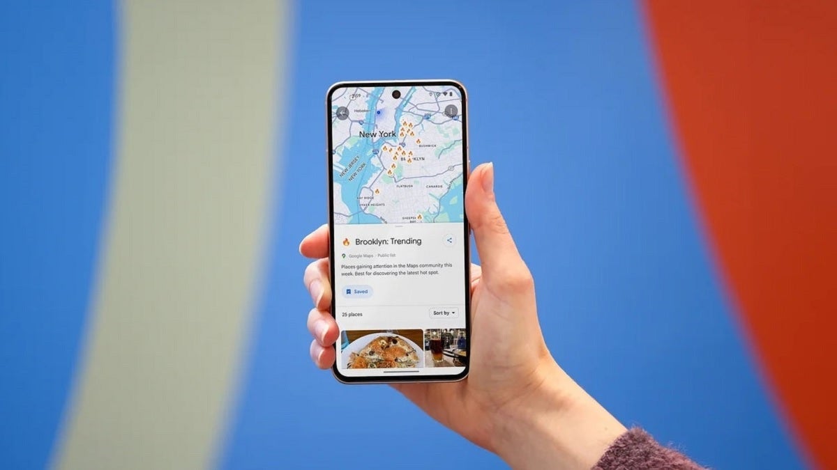
Google Maps for Android is undergoing a subtle yet significant makeover that users should be aware of. As one of the most popular applications globally, with an astounding 154 million daily active users, Google Maps has become an indispensable tool for many. Users in the U.S. spend an average of 23 minutes a day navigating through the app, whether it’s for turn-by-turn directions, discovering local dining options, finding historical landmarks, or planning trips. 
It’s an app that does so much more than simply guide you to your destination.
As part of its ongoing efforts to enhance user experience, Google has been tweaking the design of its Android app with small, but impactful changes. Though some may wonder if a team of developers is locked in a room tasked with dreaming up design adjustments, it’s clear that each change serves a larger purpose to improve usability.
So, what’s new in this update? Let’s break it down.
New UI Changes in Google Maps for Android
Google Maps for Android has received updates to two crucial buttons: the Floating Action Button (FAB) and the location button. These changes might seem small at first glance, but they could make navigating the app smoother and more intuitive.
First, the Floating Action Button (FAB) located at the bottom right corner of the screen has been made smaller. Previously, this button was large and somewhat overpowering, but now it’s more streamlined. It features a new teal color with a diamond-shaped icon inside, showing a teal arrow pointing to the right. When you type in your destination and tap this button, you’re taken to a new screen that lets you plan your journey. Here, you can easily add stops along your route. To do this, tap the three-dot icon next to the “Your location” field, then select “Edit stops.”
Additionally, tapping on the three-dot icon opens up a menu of options to customize your route further. You can change your vehicle’s avatar, choose more fuel-efficient routes, avoid tolls, highways, and ferries, or even view toll-road price estimates. This enhanced level of customization gives users greater control over their travel plans.
The second button to undergo a redesign is the location button, which is located just above the FAB. In its previous iteration, the location button was represented by a simple blue arrow inside a circle, which helped users pinpoint their current location on the map. However, the updated version of the button adopts a squircle shape (a square with rounded corners), resembling a compass icon. This new design aims to make the button more visually distinctive and easier to spot. If the map isn’t showing your current position, the icon will change into a blue dot, representing your location.
Other UI Tweaks: Layers Button Gets an Update
Moving further up the screen, Google Maps has also made adjustments to the layers button, which is located on the right side of the map interface. Previously a simple icon, the layers button now includes a small dot inside the icon. Tapping this button reveals options to switch between different map views, such as the default map, satellite view, or a terrain view, which provides a more detailed look at the landscape around you.
This layers button also gives users access to critical features such as color-coded traffic indicators, details about public transit routes, bicycle paths, and even street-level views of your journey. These new design improvements give users more options for customizing their map view, allowing them to focus on what’s most important to them.
When Will You See These Changes?
These UI updates are being rolled out to Android users with version 25.39 of Google Maps. As of now, I’ve noticed the changes on my Pixel 6 Pro, which is running Google Maps version 25.40. If you haven’t received the update yet, you can download or update the app through the Google Play Store.
What’s particularly intriguing about these changes is the thought process behind them. Google’s research likely showed that Android users would more easily associate the blue dot on the location button with the same blue dot used to show their current position on the map. This subtle visual connection enhances the user experience, ensuring that the app feels cohesive and intuitive. Google’s design changes are never random; they are backed by data-driven decisions aimed at improving usability.
In conclusion, while these changes to the Google Maps Android app may seem small, they reflect a deliberate effort to enhance the user experience and make navigation even easier. Whether you’re planning a road trip or just finding your way around the city, these updates should make using Google Maps a little bit more enjoyable.
4 comments
I think Google is making these small updates so that they don’t mess up what already works. Smart move
Love the new map views, especially the terrain mode! Helps a lot when hiking 🌄
This update is pretty cool, but I wish they made the FAB button even smaller. It feels too big still 👀
Anyone else notice that the app feels faster with this update? Maybe it’s just me 🤷♂️