
One UI 8.5 Hands-On: A Deep Dive into Samsung’s Boldest Update Yet
Samsung is preparing for one of its most ambitious software updates in years with One UI 8.5, and while it hasn’t officially been released – and won’t be until at least 2026 – early test builds on the Galaxy S25 Ultra are already giving us a glimpse into the company’s future vision for its mobile ecosystem. What we’ve seen so far is both exciting and controversial, a blend of fresh customization options and questionable design choices that are bound to spark heated debate among Samsung fans.
At its core, One UI has always been about balancing power and accessibility. Samsung’s philosophy has been to deliver feature-rich software without overwhelming the average user, and since its inception, One UI has been celebrated for clean layouts, legible typography, and helpful visual cues like icon labels. Now, with One UI 8.5, Samsung seems eager to shake things up, and not all of these changes may be welcomed with open arms.
The Big Controversy: Icon Labels Disappear
Let’s start with one of the most polarizing changes: Samsung has quietly removed the text labels from navigation icons at the bottom of its apps. For example, in the Gallery and Phone apps, the bottom bar now consists solely of symbols with no explanatory text beneath them. While seasoned users may easily recognize these icons, casual users – or those less tech-savvy – may find this a frustrating step backward. It’s reminiscent of certain design experiments we’ve seen from other tech giants where simplicity was mistaken for usability.
Samsung’s critics argue that this is design for design’s sake, a superficial attempt to mimic minimalism at the cost of accessibility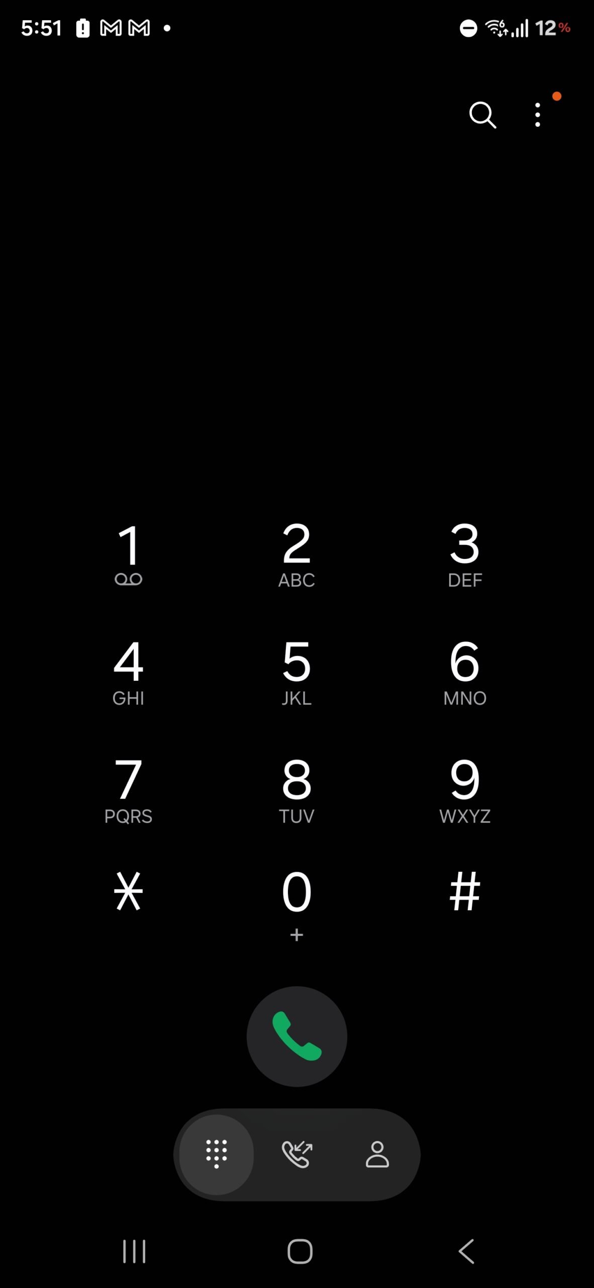

. For years, One UI’s charm lay in how it managed to remain user-friendly despite its complexity. Removing helpful context risks alienating a portion of the user base, especially those who rely on clarity rather than guesswork.
Quick Panel: A New Era of Customization
Thankfully, One UI 8.5 doesn’t stop at questionable visual tweaks. In fact, some of the improvements are nothing short of excellent. The quick panel, one of the most-used features on Galaxy devices, has been reinvented to offer an almost limitless degree of customization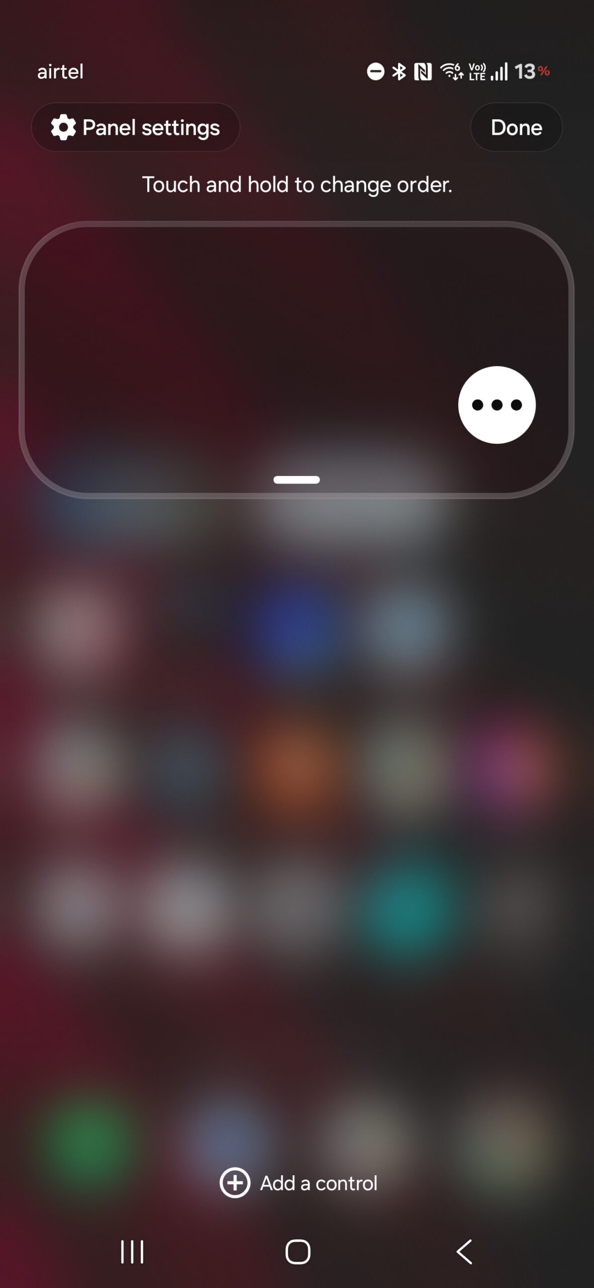
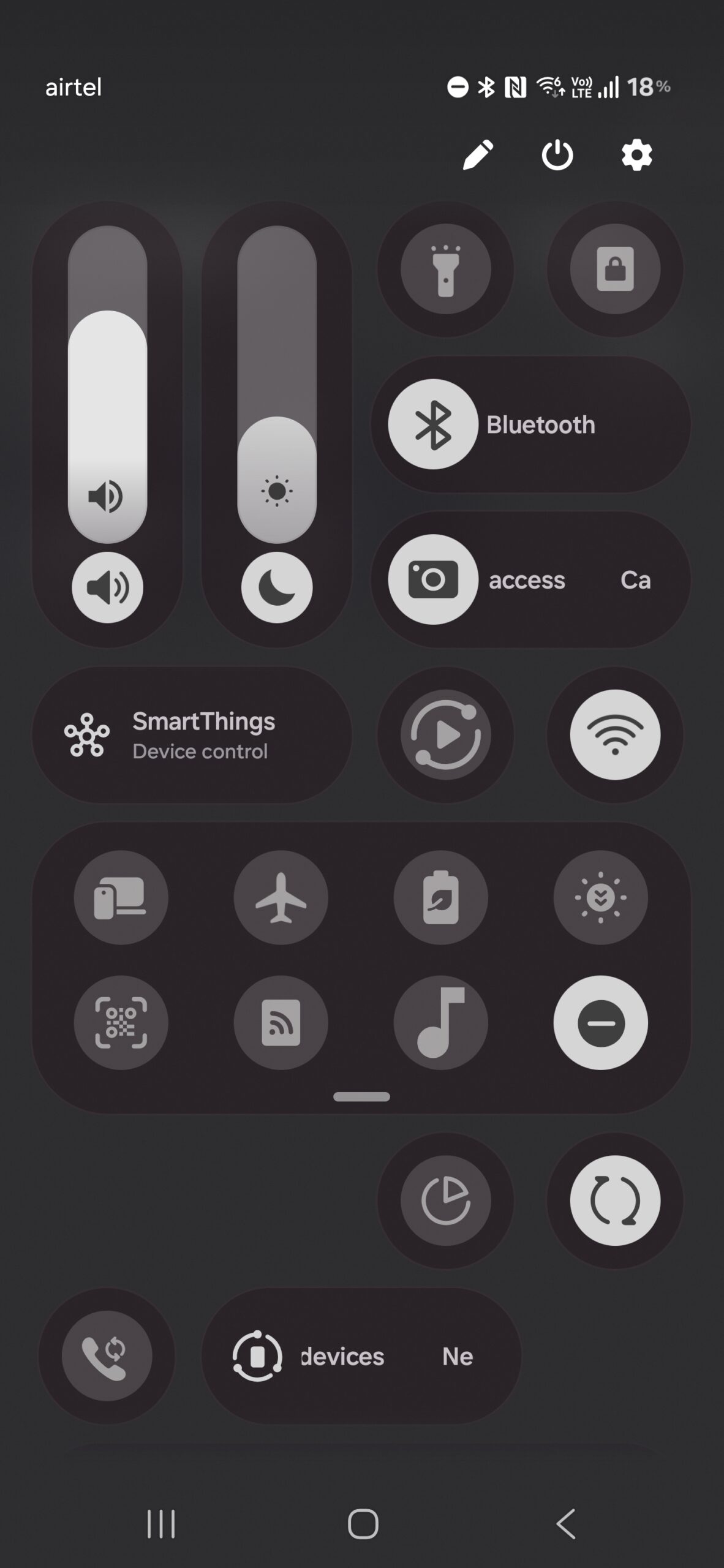
. Users can rearrange toggles, sliders, and widgets in any order they prefer. The brightness and volume sliders now have orientation flexibility: horizontal or vertical, depending on what feels natural to you. And for minimalists, the panel can be stripped down to the bare essentials, leaving only the controls you actually need.
This level of freedom is a big win for power users who’ve long wanted finer control over their phone’s interface. It also sets Samsung apart from competitors like Apple, whose Control Center remains comparatively rigid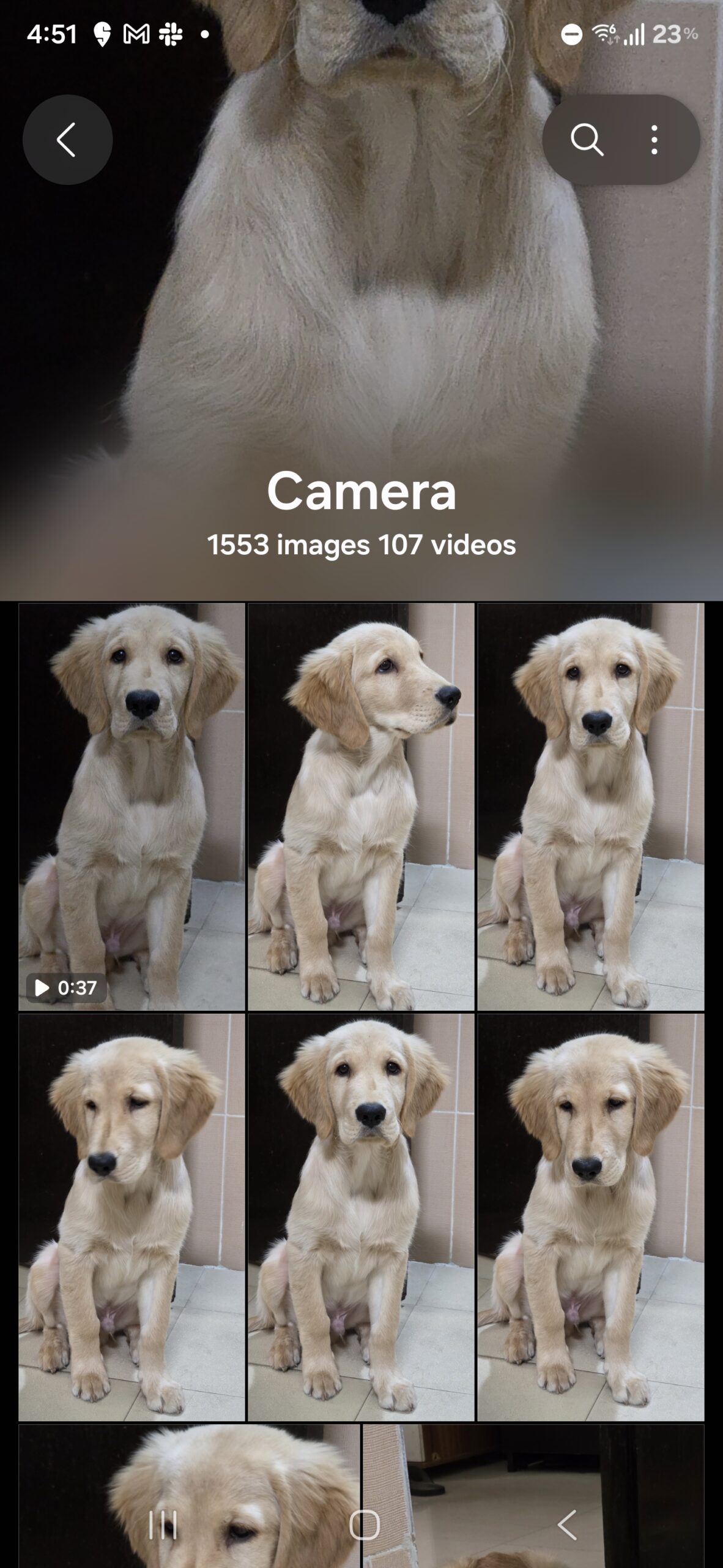
. If One UI 8.5 sticks with this direction, it could redefine how personalization is handled on Android devices.
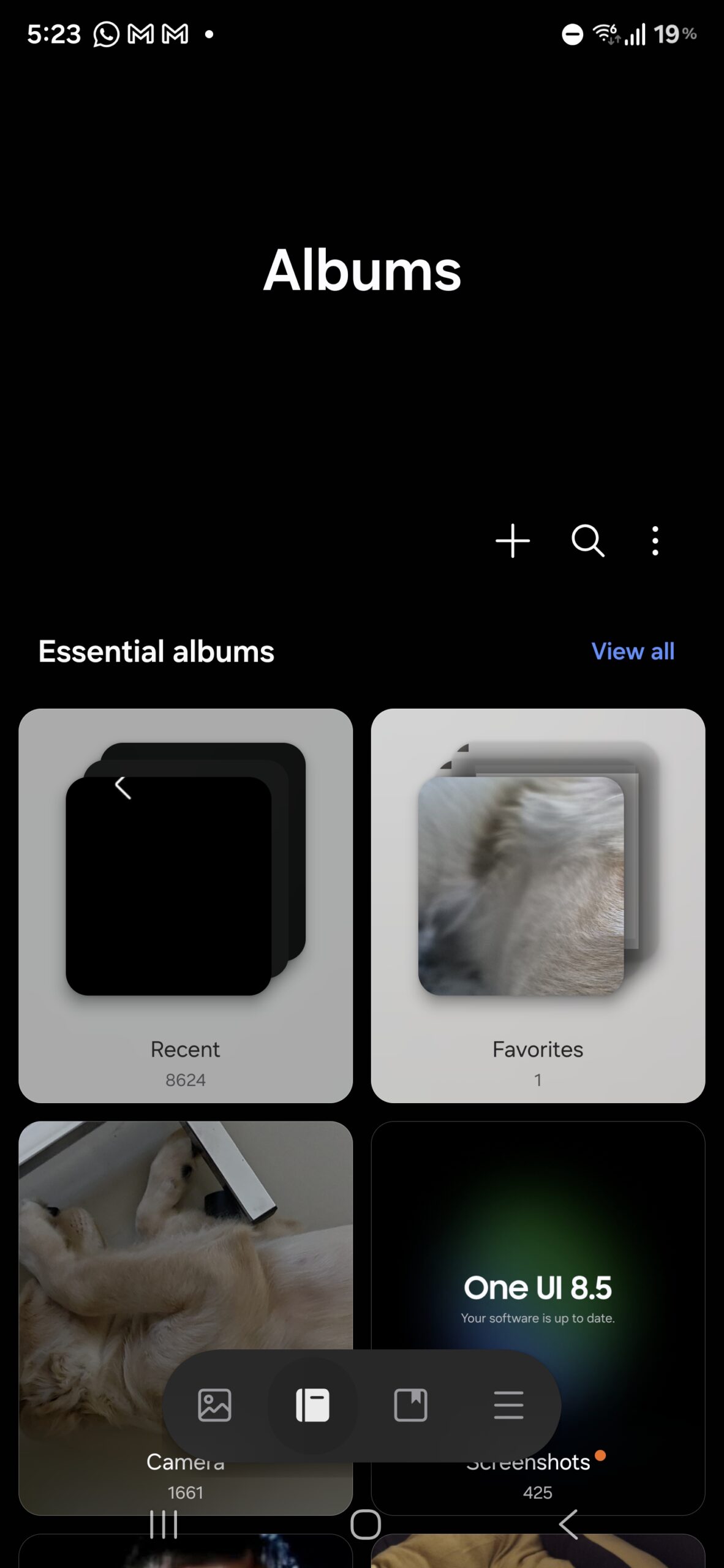
The Gallery App: Inspired by iOS, But Still Samsung
Another area of significant change is the Gallery app. Visually, it looks like a brand-new application. Buttons are bolder and larger, giving the interface a friendlier, touch-first feel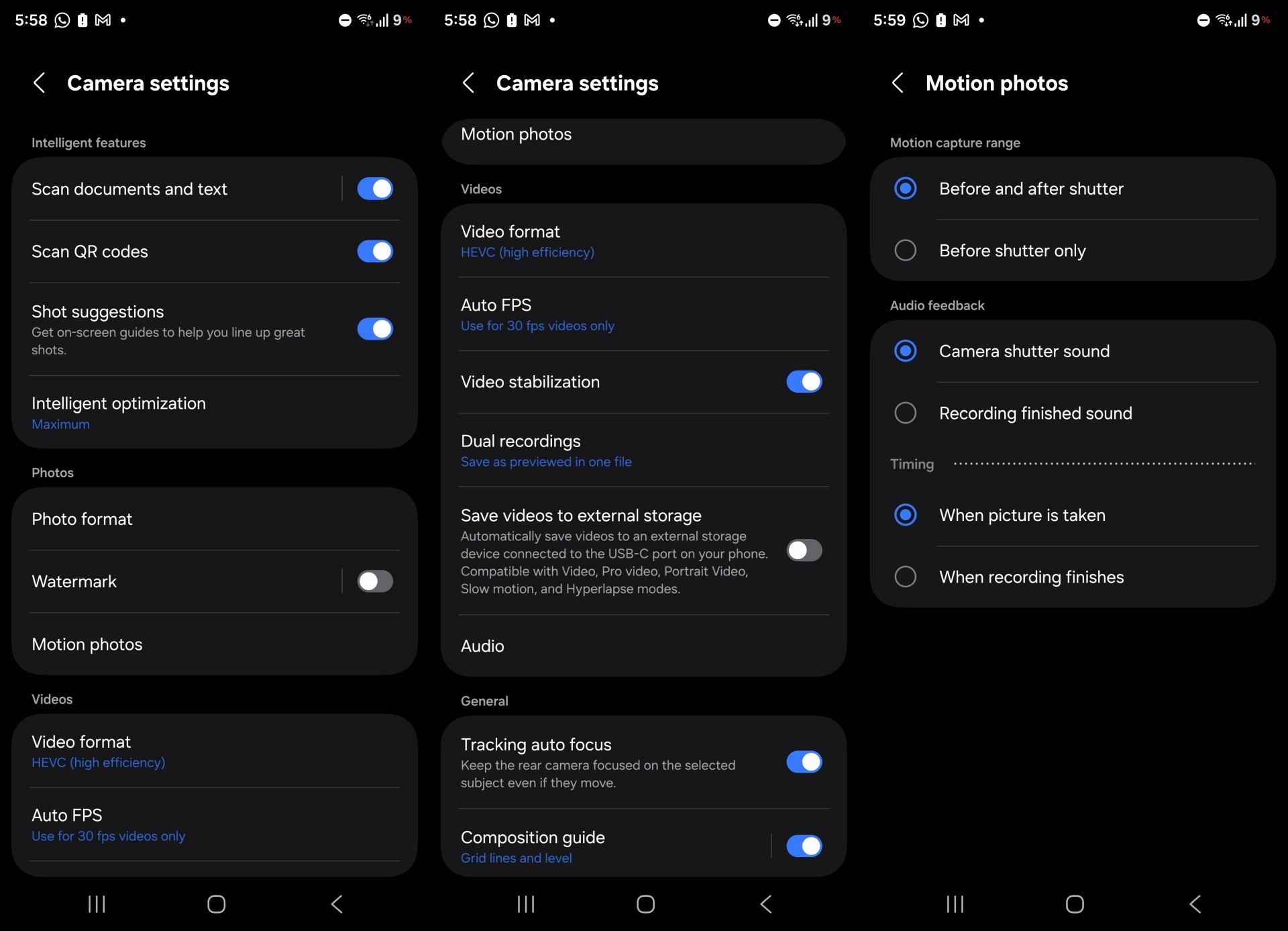
. Instead of a bland text header, each album now showcases a dynamic preview of its most recent photo or video at the top. This is a clear nod to iOS’s design language, but Samsung adds its own flavor to keep things distinct. 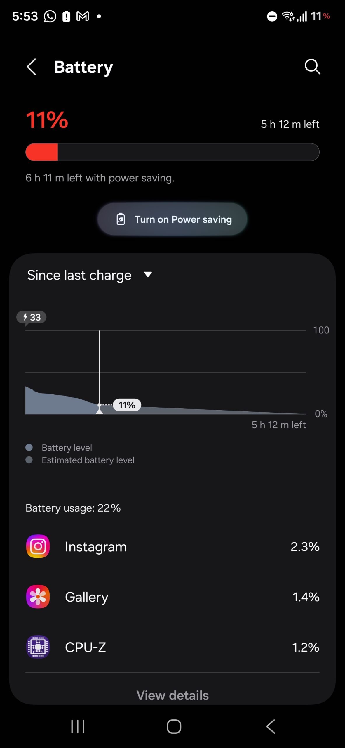
The new look isn’t just aesthetic; it improves discoverability by making it instantly obvious what’s inside an album without needing to open it.
For heavy media users, this redesign will be a breath of fresh air, blending practicality with personality. Whether it becomes a fan favorite will depend on how smoothly it performs once optimized for the final release.
Camera App: Refinement Over Reinvention
Samsung’s Camera app has always been one of its crown jewels, packed with features and shooting modes. 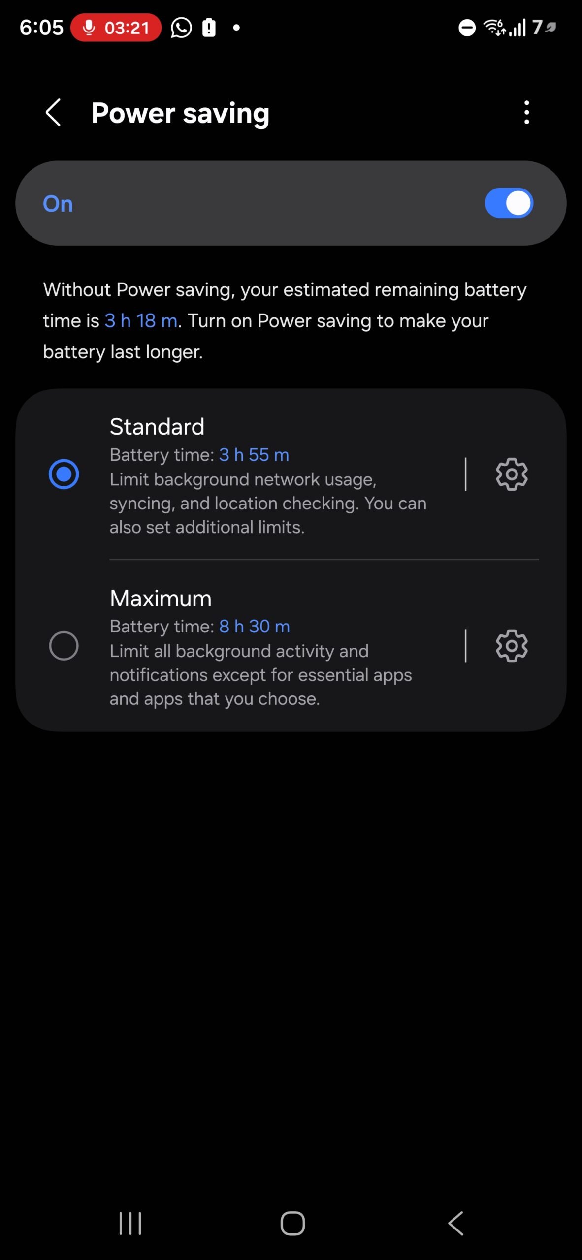
With One UI 8.5, the app remains largely familiar but introduces a restructured settings layout. 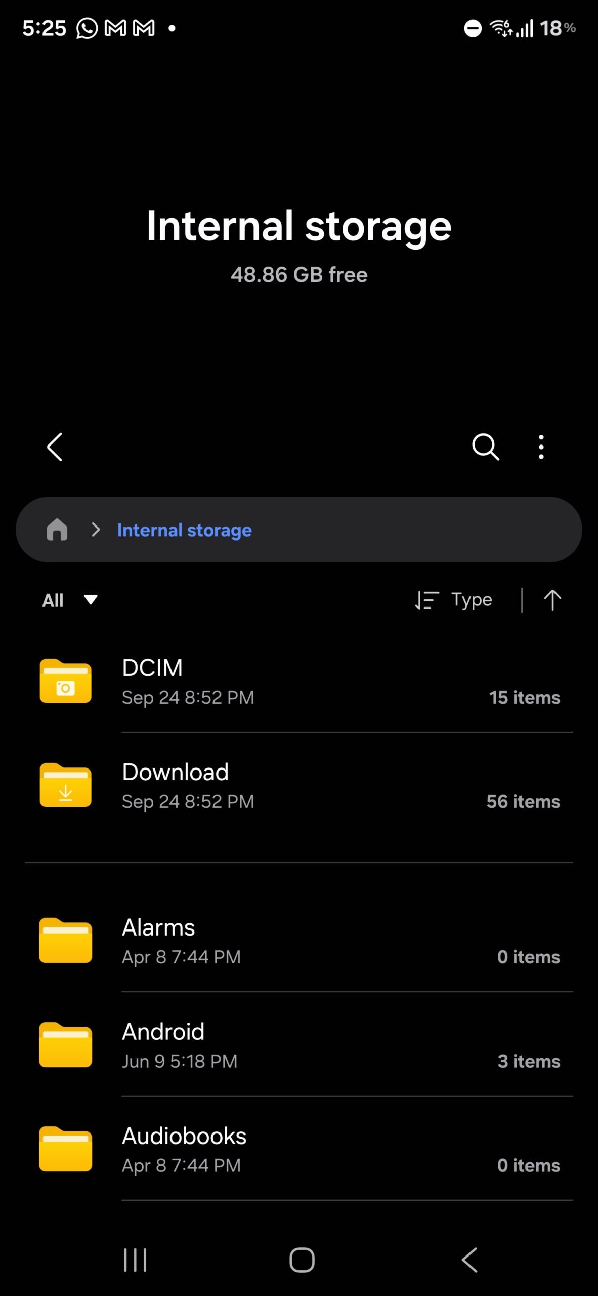
Video options are now neatly categorized into menus for audio controls, recording formats like HDR and log, and dual-recording options. Settings for motion photos and watermarks have also been expanded for clarity. 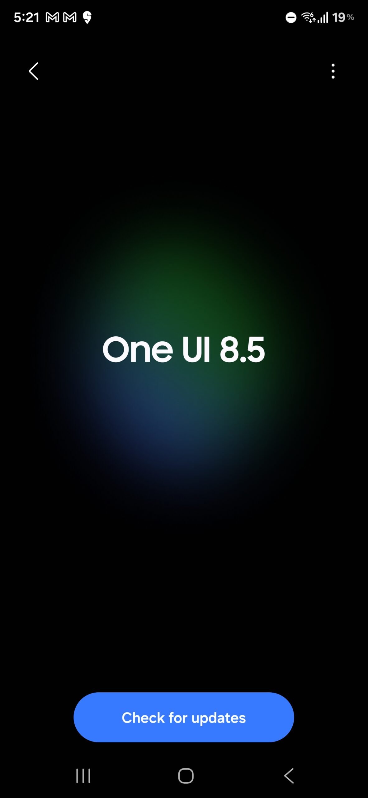
While there aren’t any groundbreaking new features in this early build, the improved organization makes advanced tools easier to find and use – a subtle but valuable quality-of-life upgrade.
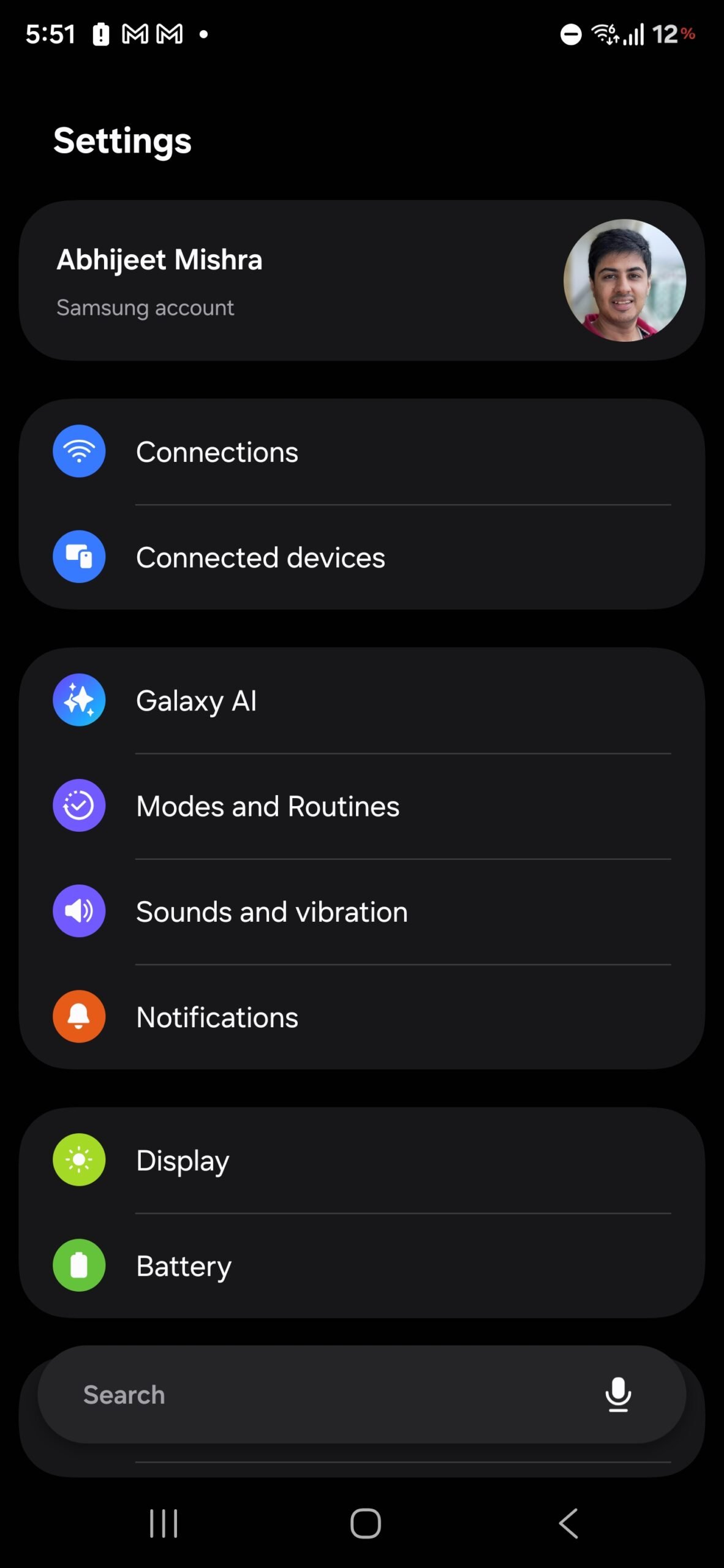
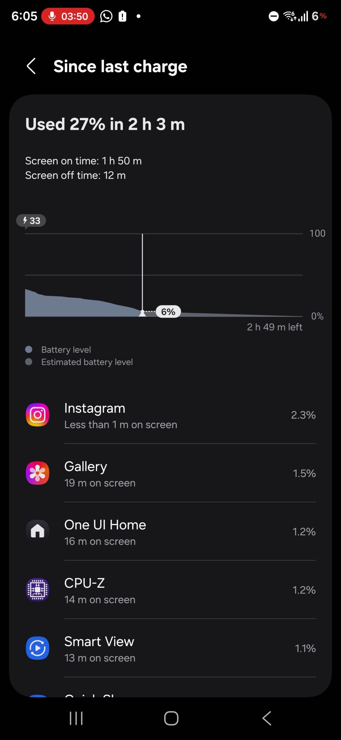
Settings and Battery: Small Details, Big Impact
Across the broader system, Samsung is leaning heavily into softer visuals and smoother interactions. The Settings app has been refreshed with rounded corners, larger spacing between elements, and buttery animations that make navigation feel less rigid. Interestingly, the search bar has migrated to the bottom of the screen, aligning with ergonomic principles that prioritize thumb reachability. The battery menu has also been revamped, offering clearer breakdowns and fresh UI elements that make power management more intuitive.
The most noticeable status bar change? The classic battery icon is gone. Instead, users now see a simple numerical percentage. While charging, the existing One UI 7 animation remains, but new dynamic elements add flair: the percentage turns red at low battery levels and morphs into a green leaf when power-saving mode is activated. It’s a small tweak, but one that cleverly communicates device state without additional clutter.
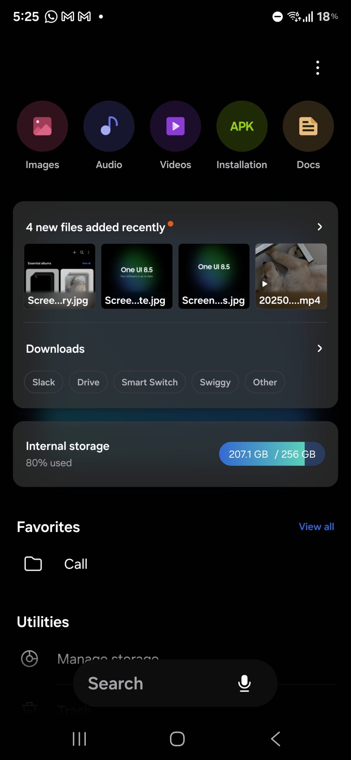
My Files and Subtle Enhancements
The My Files app hasn’t been ignored either. Samsung has introduced a bottom-aligned search bar, mirroring the design shift in Settings. The main interface now highlights key sections like Recent Files and Internal Storage with a translucent, glass-like effect that adds polish. It’s a modest but welcome change, helping important features stand out without overhauling the app entirely.
A Playful Touch: Samsung’s Own “Easter Egg”
Perhaps one of the most surprising changes is Samsung’s decision to bring the Android easter egg concept front and center. When you open Settings > Software update, you’re greeted with a splash image proudly displaying the One UI version. Beneath it, a clearly marked Check for updates button awaits, with secondary options like Auto-download over Wi-Fi tucked neatly into a More menu. This playful visual element adds character while improving usability, ensuring users know exactly where they are and what they can do next.
What’s Missing – For Now
It’s important to remember that this is still a test build. Several rumored features are absent, such as NFC-based file transfers (where two devices can simply be tapped together to share files) and AI-powered tools like Meeting Assist or auto-generated product reviews. These features may arrive later as development progresses, but for now, One UI 8.5 is clearly focused on visual evolution rather than functional leaps.
Final Thoughts: A Work in Progress, But Promising
One UI 8.5 may not be the revolution some users were expecting, but it is a bold iteration that demonstrates Samsung’s willingness to experiment. The removal of icon labels may anger usability purists, yet the newfound flexibility in customization, the refined Gallery and Camera experiences, and the polished system-wide aesthetics all hint at a platform growing more confident in its identity. If Samsung manages to integrate the missing AI tools and advanced features without compromising stability, One UI 8.5 could become one of the company’s most beloved updates.
For now, what we’ve tested is equal parts exciting and unfinished – a snapshot of Samsung’s software philosophy in transition. Fans can expect heated debates, but also plenty to look forward to as the update marches toward its eventual release on Galaxy devices.
1 comment
feels like too much ios copying tbh