Google has officially drawn a line in the sand for Android developers, declaring that the era of mismatched and inconsistent app icons is over. In a move announced on Tuesday, the company revealed a key revision to its Google Play Developer Distribution Agreement (DDA). 
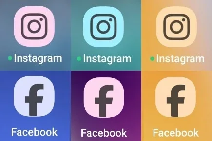
The updated terms require all Android app developers to provide support for themed icons, a feature that allows the system to recolor app icons based on a dominant hue extracted from the user’s wallpaper. While this feature debuted with Android 13 back in 2022, it was optional – and most developers opted out, leaving home screens with a patchwork of themed and unthemed icons that many users found visually chaotic.
Google’s frustration with developer reluctance is evident in its new policy. The revised DDA, specifically section 5.3, now grants the company a broad license to alter app icons. This includes adding themes and adjusting colors without seeking further approval from the app publisher. By embedding these terms into the agreement, Google ensures that developers no longer have the option to resist. From this point forward, uniformity is not a matter of choice – it is a requirement if developers want to stay listed on the Google Play Store.
The rollout timeline is strict. As of September 15th, all new developer accounts must comply with the new rules. For existing developers, the deadline is October 15th. Any developer unwilling to accept the revised DDA risks having their app delisted. Moreover, developers are tasked with providing Google not just their usual branded icon, but also a monochromatic version. This stripped-down variant will serve as the foundation for themed recoloring, ensuring every app icon can be tinted and aligned with the user’s system-wide aesthetic.
For Android users, the immediate payoff is a home screen that feels consistent, polished, and modern. In the past, enabling themed icons often left users with an uneven display: some apps would follow the system’s visual rhythm while others stubbornly kept their default look. The result was a jarring, sometimes “ugly” mix that undermined the clean design Android’s Material You aimed to deliver. Now, with the mandate in place, every app icon on a phone can adapt seamlessly to wallpaper-driven themes, offering what Google describes as a “cohesive home screen experience.”
However, the change is not without controversy. By requiring developers to hand over monochromatic icons and accepting Google’s right to recolor their branding, some app makers feel they are losing control over a key aspect of their identity. An icon is more than a button; it represents years of branding investment, recognition, and user loyalty. Forcing monochromatic compliance and automated recoloring reduces that individuality. Yet, Google insists the trade-off is worth it, prioritizing user experience over developer freedom.
From a broader perspective, the move reflects Google’s increasing willingness to standardize Android aesthetics. Historically, one of Android’s appeals was the freedom it offered both users and developers compared to Apple’s tightly controlled ecosystem. But freedom often comes at the cost of cohesion, and Google seems determined to close that gap. In practice, this means the Android experience may begin looking a bit more like iOS, where consistency is enforced from the top down.
For everyday users, the question remains: will this mandate genuinely improve the experience, or will it spark frustration among developers and users who prefer originality over uniformity? Regardless, the deadline is set. Developers who fail to comply won’t just lose design freedom – they risk losing visibility entirely if their apps vanish from the Play Store. For millions of Android users, that means whether they like it or not, their home screens are about to get a major aesthetic upgrade.
1 comment
who even uses themed icons? i turned it off on day one