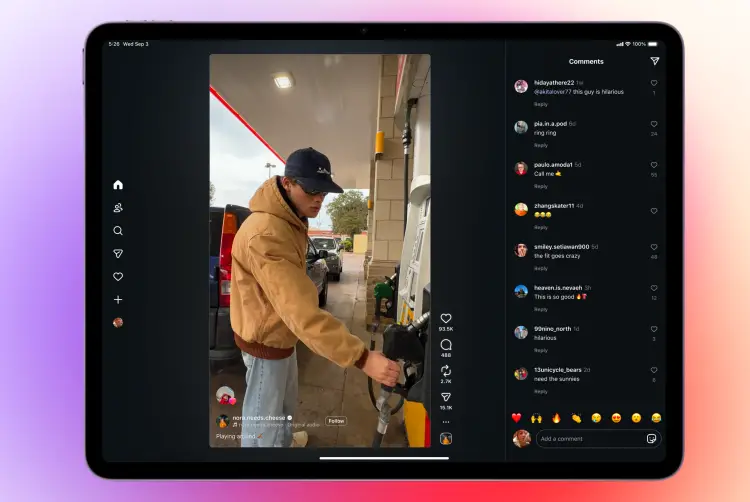
After years of requests and countless jokes about its absence, Instagram has finally launched an official iPad app. 
Yes, it’s real this time – not a prank, not a rumor, and not a half-hearted workaround. The arrival of Instagram on iPad marks a turning point for Apple tablet owners who have long been stuck with stretched iPhone interfaces or third-party solutions.
Instagram says it wanted to build something tailored to the iPad’s larger screen, promising an experience that feels familiar but refined. The app launches directly into Reels, making short-form video content the centerpiece of the design. Stories sit neatly at the top, messaging is accessible in a single tap, and there’s even a new Following tab with three filters – All, Friends, and Latest – so users can customize how they browse posts and reels. This flexibility addresses one of the common criticisms of Instagram’s feed organization, even if the feed itself still looks oddly centered on the iPad’s display.
That brings us to one of the more divisive aspects of the new app: the layout. While Reels benefit from the vertical space, many users are pointing out that photos and posts don’t take advantage of the entire tablet screen. The app leaves wide margins, almost as if Instagram wasn’t sure how to balance iPad’s unique aspect ratios. For some, this empty space is a wasted opportunity. Others argue it actually works in Reels’ favor, allowing comments to expand alongside videos without shrinking the content.
It’s difficult not to wonder why this took so long. Instagram executives have hinted before at challenges with scaling and adapting the interface, but fans still find it puzzling that a company of Meta’s size struggled to prioritize one of the most requested features in its history. As one user sarcastically put it, “We got Instagram on iPad before GTA VI.” The comparison might be tongue-in-cheek, but it highlights just how overdue this release feels.
The rollout is global for iPadOS 15.1 and newer, and Instagram has already confirmed that the updated design will eventually come to Android tablets too. In practice, this could reshape how creators and casual users engage with the platform – especially those who rely on bigger screens for editing content or managing multiple accounts.
While not perfect, the app is a milestone that signals Instagram’s willingness to treat the iPad as more than an afterthought. It may not fill the screen in the way many hoped, but it finally delivers a native experience that feels modern, faster, and more aligned with the platform’s core focus on short video and interaction.
3 comments
this ui is trash, why not just let posts fill screen or give us 2 tabs side by side??
im dead bro, insta on ipad finally… but still no full screen 💔
meta prob did this just to push ppl to android tablets lol