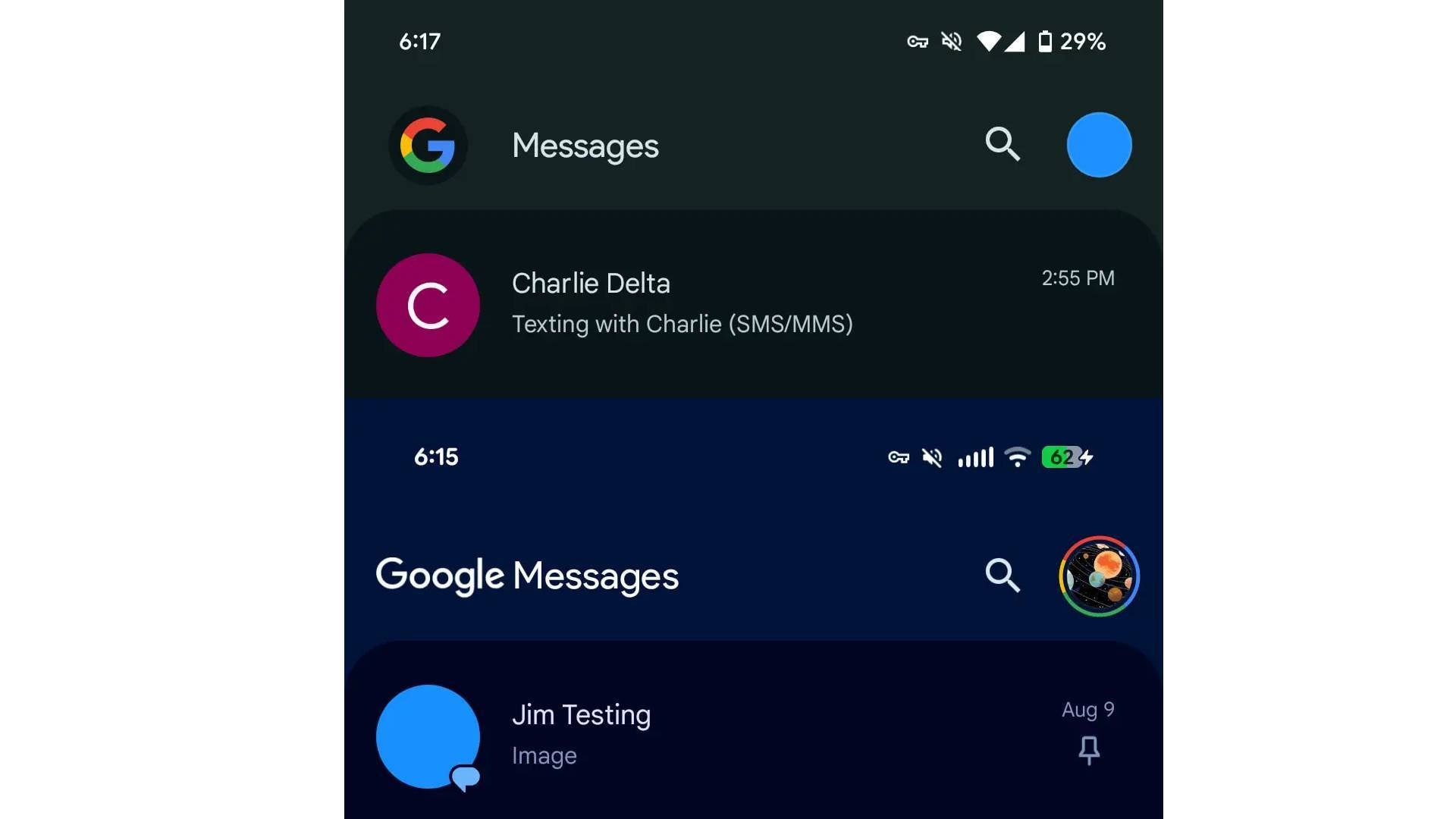
Google Messages has bid farewell to a familiar icon. The app, which has been evolving for some time, has made a significant change: the iconic ‘G’ logo is now gone, replaced with the full ‘Google Messages’ name for some users. A report from July revealed that this shift was coming, and now, it’s official for beta testers. Previously, users were greeted by the ‘G’ logo whenever the app launched, but that’s no longer the case for everyone. 
The new version of the app embraces the Material 3 Expressive design language, aligning with Google’s broader push for a modernized, cohesive interface.
One of the most obvious updates is the lack of individual boxes for each row, which has now been replaced by a single container for a cleaner, tidier look. Additionally, contact photos have been made larger, enhancing the visual appeal. Even the app and status bar have merged, further streamlining the user interface. But it’s the rebranding that’s causing the most buzz.
For beta users, the familiar ‘G’ logo has been swapped out for the ‘Google Messages’ wordmark, with ‘Google’ in its traditional font and ‘Messages’ in a more standard typeface. On the stable version of the app, users will still see the ‘G’ logo, but it’s been given a new design. The ‘G’ is now inside a circle, matching the circular profile menu icon next to it. This subtle tweak aims for a more unified and neat aesthetic across the app.
As the update is being rolled out gradually, don’t be surprised if you don’t see the changes right away. The shift to the full text for branding is part of a larger trend seen across several other Google apps, including Photos, Calendar, and Drive. The iconic ‘G’ logo has long been synonymous with the tech giant, and most users already associate it with Google. So, why the change? The full name ‘Google Messages’ makes the app instantly recognizable, which could explain why Google decided to phase out the ‘G’ logo in favor of a cleaner look with the company’s wordmark.
While it’s a bold move, Google is no stranger to making changes to its apps. If this rebranding decision doesn’t sit well with users, the company could always backtrack, as it has done in the past with other features.
4 comments
Google always changing things… idk if I like this one or not 😬
Can’t they just leave things alone? The ‘G’ was iconic!! 🙄
I really like the new look, but the ‘G’ logo had its charm 😅
Wow, I didn’t even notice the ‘G’ was gone until now! 🤔 It’s such a small change but it does look cleaner